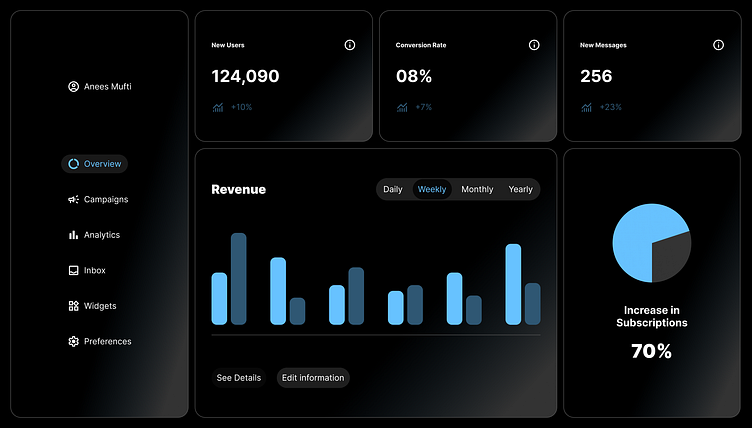
Clean Dashboard Design
Minimal design
A design of a dark mode dashboard that can be used in multiple applications. My idea with this project was to see how clean of a design I could possibly create. Avoiding clutter and only the essentials. The outcome came out looking great, simple, modern and easy on the eyes. Now, I understand dashboards can be a lot more complex than this but this was just to show what a clean one might look like, and if you like this let me know maybe yours will look even better if we collaborate on your project.
More by Anees Mufti View profile
Like
