DBComposite: Reimagining Composite Material Management 🧪
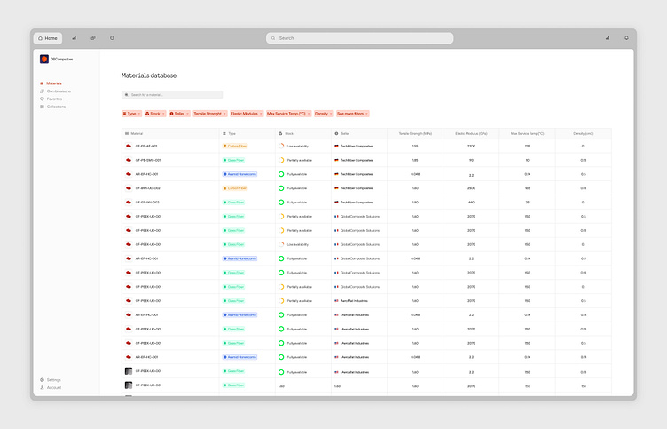
Hey Dribbble community! 👋 Excited to share a peek into MateriaMind, a sleek interface designed to revolutionize how we interact with composite material data.
MateriaMind is all about making complex material information accessible and actionable. This clean, data-rich design transforms overwhelming technical specs into an intuitive, user-friendly experience.
✨ Key Features:
Comprehensive material database with easy-to-scan entries
Smart filtering system for quick material comparisons
Visual indicators for stock availability and material types
Detailed specifications including tensile strength, elastic modulus, and max service temp
Sleek sidebar navigation for seamless workflow
🎨 Design Highlights:
Soft color palette with a light pink background for reduced eye strain
Color-coded material types and availability status for quick visual parsing
Clean, tabular layout for effortless data comparison
Minimalist icons enhancing the overall aesthetic while improving usability
The challenge was to present highly technical data in a way that's both comprehensive and approachable. We aimed to create a tool that engineers and designers alike would find indispensable in their material selection process.
What are your thoughts on designing for data-heavy applications? How would you balance information density with user-friendly design? Always eager to hear your insights and experiences! 💡🔬
