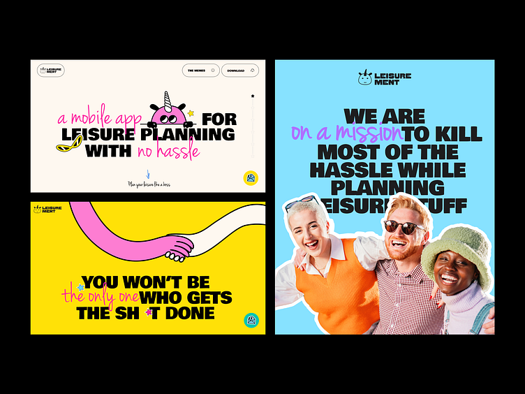
Brand identity for the leisure planning app
Get ready for a visual feast! We are excited to demonstrate how Leisurement's lively personality shines through every interaction. This isn't just branding - it's a mood, a vibe, a whole new way to think about planning your good times!
Key elements that make this brand pop:
Bold typography that mixes playful handwriting with strong statements 📢
A color palette that screams "fun times ahead!" - think vivid yellows, pinks, and blues 🌈
Our cheeky unicorn mascot, adding personality to every corner 🦄
Real people imagery showcasing the joy of hassle-free hangouts 😄
Consistent messaging that's both witty and relatable 💬
From website design to social media banners, we've crafted a visual language that's impossible to ignore. It's not just about looking good - it's about feeling good. Every element reinforces Leisurement's mission: killing the hassle in planning so you can focus on the fun!
This is how modern brands should communicate - with personality, consistency, and a dash of sass. Whether you're on the app, the website, or seeing an ad, you know it's Leisurement at a glance.
Brilliant minds on this project
Yana Shvedyk — UI/UX design
Sophia Lev — Graphic design
Yehor Mushka — Development
Yaroslav Khaletskiy — Sales
Daryna Kozachuk — UI Design
Oles Pasychnik — Animation
________________________________
Want your brand to stand out like Leisurement?
Let's add some cream on top: collab@theqream.com
