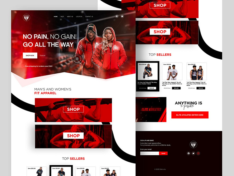
Fitness Website Landing Page UI Design
Introduction Our new website UI design for Fitness Coach aims to provide a fresh and modern look with captivating animations and improved organization, enhancing the user experience.
Highlight Sections
We have strategically included the "Men's & Women's Apparel" section to showcase our diverse product offerings. The "Top Selling Products" section is designed to display our most popular items prominently, and our "About Us" page features a subscription option for user engagement.
Design Elements
We've integrated our brand colors into the design for consistency, creating a visually appealing and cohesive look. The inclusion of relevant images enhances the user experience, while the user-friendly navigation bar ensures smooth navigation.
Landing Page
The landing page serves the purpose of showcasing our skills and expertise. Its modern and attractive design is intended to captivate visitors and encourage them to explore our website further.
"Fitness Website Landing Page UI Design"
The new website UI offers essential features and benefits that improve user interaction. We encourage you to explore our website and see the design firsthand. We are excited about the launch of the new UI and its potential impact.
Hope you like it, Feel free to give feedback, and don't forget to press "L" or the love button if you like it.... 😊
Visit our website www.olack.agency
Say hi.?
Drop us a few lines at hello@olack.agency
Get in touch
WhatsApp | Telegram | Skype | Cup of coffee with Olack
Stay tuned for our updates at


