UX/UI rethinking of Endel mobile App
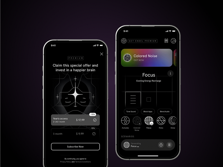
I redesigned the main screens and paywall of my favorite mobile app — Endel. The app helps to concentrate, calm down, listen to pleasant music to match the mood, plus a separate like for the animations and style of the illustrations.
BUT.
The app itself caused me a lot of questions and discomfort, sometimes it was difficult to find the necessary functions or my finger mistakenly clicked in the wrong place. So it was time to think about how to make experience more convenient, and finally I was able to try a few solutions in Figma.
📌 More details about the changes:
1. When opening the application on the main screen, it is immediately visible which listening mode is currently active. It is complemented by a player component at the bottom of the screen. On the one hand, I sacrificed an entire screen, most of which is filled with the beautiful rhythmic animation. But I'm more concerned with a quick setup, turn off the screen and start working, rather than watching animation.
2. On the main screen, the "FREE EDITION" button actually leads to a paywall with an offer to purchase a premium subscription, so I changed the button text to "GET ENDEL PREMIUM", which tells users that this is not just an existing subscription status, but a button.
3. The number of steps from the main screen to listening mode settings has been reduced from 3 to 2. Which in turn moved the "Block Apps" and "Blend Audio" buttons higher to the listening mode settings (previously these modes were also just at the bottom of the main screen and also on the listening mode page).
4. On the sound settings screen, the X button was confusing when I tried the settings for the first time. Did this mean that the changes would not be saved when exiting? And how to return to previous settings, if I tried several, but the previous one was better? The solution was two buttons, that have different functions "Undo" changes and "Update" the sound.
5. And finally paywall. The most noticeable thing is that there are too many elements on the screen, and animated illustration stands out the most, while key information is lost and difficult to read. After removing the buttons that take away attention from the subscription options (or simply do not work) and changing the accents a little, I got an uncluttered screen with a clear message and accents on the annual subscription and the "Subscribe" button.
👇 What do you think about the changes? Write your opinion, whether it has become better or worse, and why. What else would you change? Or what should be left as it is?


