Cedar Spoon Ice Cream
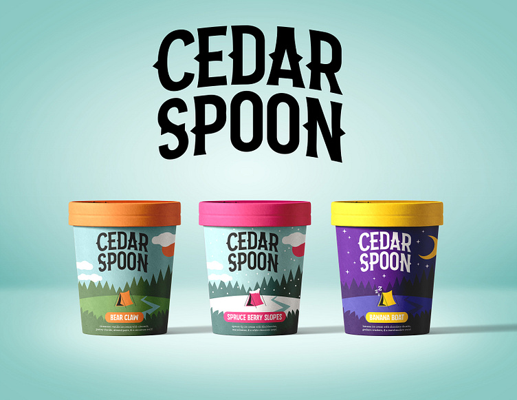
The goal of this project was to create a fictitious typography-focused ice cream brand (after all, the choice of typefaces can say a lot about a brand!). My brand, Cedar Spoon, is an organic camping and wilderness-themed ice cream with an emphasis on nostalgic and rustic flavors.
Fonts used
Logo: Camping (modified)
Flavor names: April Easter
Description: BioRhyme Regular
