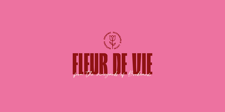
Wine Logo & Label Design | Fleur de Vie
BUSINESS: A natural and sustainable wine brand made by two badass women in the French countryside.
TARGET AUDIENCE: Millennials seeking natural and eco-friendly options devoid of chemicals or additives.
PROJECT GOAL: To establish Fleur De Vie as the go-to wine brand for environmentally conscious millennials all whilst creating aesthetically pleasing labels, perfect for girly picnics that foster a community passionate about sustainability.
SERVICES: BRANDING & PACKAGING
Fleur de Vie means ‘flower of life’.
I combined a bold typeface with a romantic script to emphasise the contrast between the strong message behind the brand and the touch of elegance and luxury of the feminine side. The fruit illustrations serve as an indicator to the type of notes each wine has so that the consumer can make a quick decision based on their favourite combos.


