HONEY STORE | E-COMMERCE | UX/UI DESIGN

ABOUT THE PROJECT
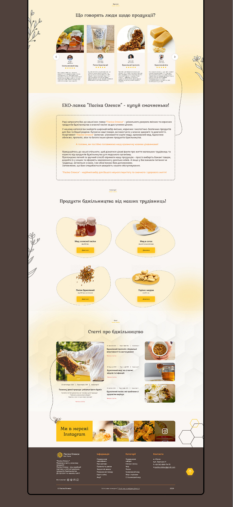
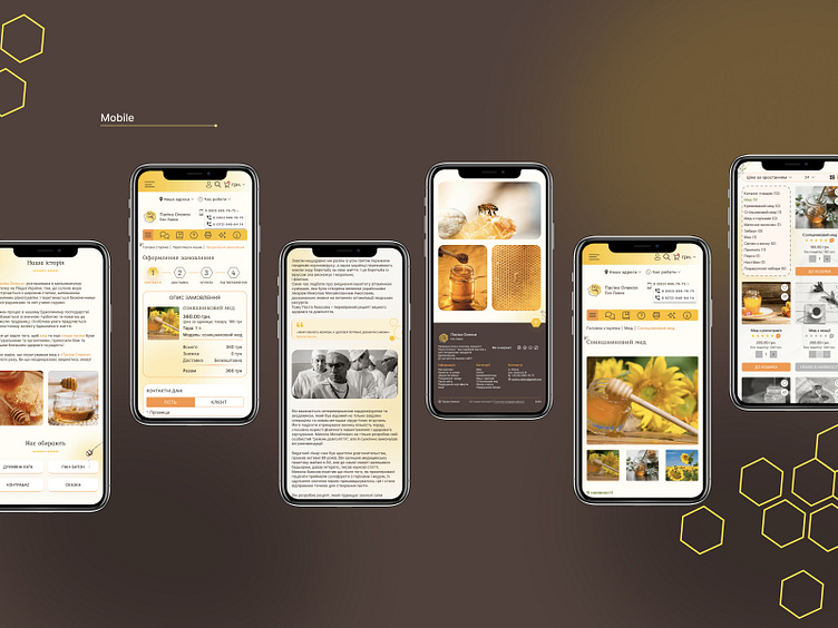
This project is a web design for an online store specializing in the sale of natural honey. The goal was to create an intuitive and visually appealing interface that would emphasize the naturalness of the product and provide a convenient user experience.
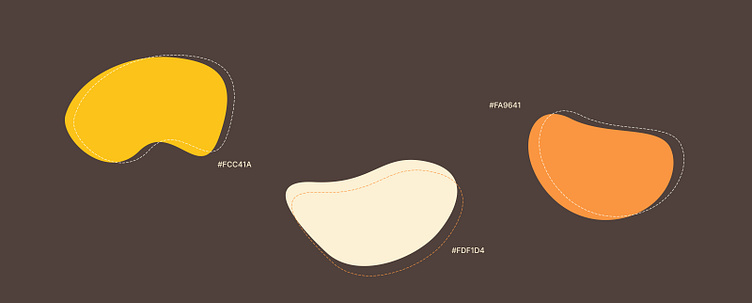
COLOR PALETTE
Orange color in web design for an online honey store can be quite effective. Orange is often associated with warmth, energy, and enthusiasm, which can complement the natural and vibrant qualities of honey.
Yellow is a fantastic color choice for an online honey store. It conveys warmth, optimism, and energy, which align well with the natural and inviting qualities of honey.
Beige is an excellent color choice for an online honey store, as it conveys a sense of simplicity, elegance, and warmth. It complements the natural and wholesome qualities of honey.
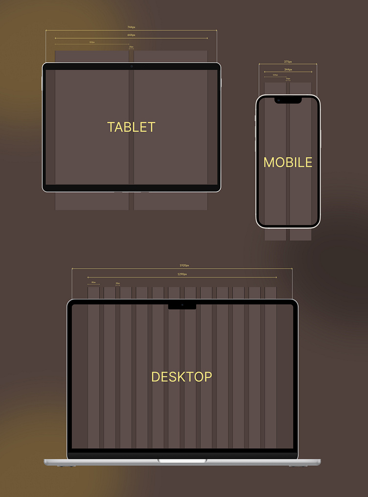
GRID SYSTEM
A grid system is a design framework that provides a structured layout for organizing content and design elements.
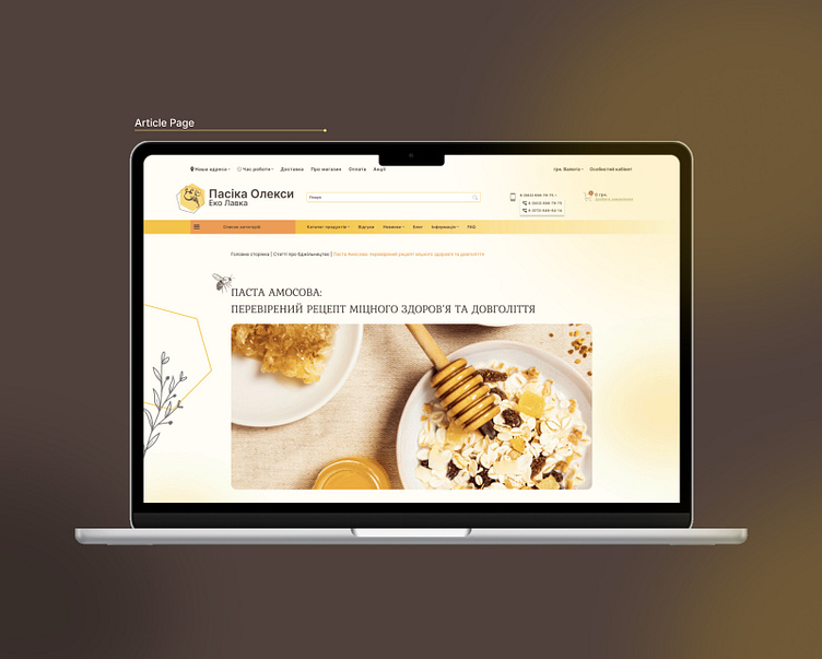
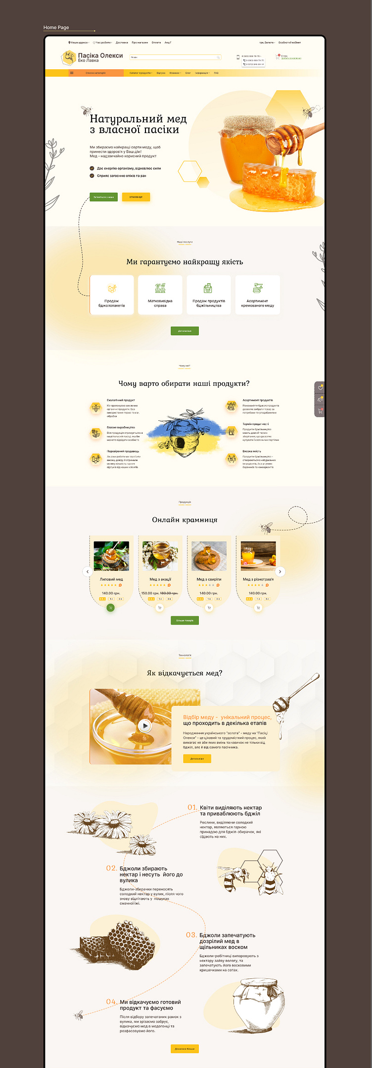
HOME PAGE
THANK YOU FOR WATCHING!
LET'S TALK ABOUT YOUR NEXT PROJECT 👋
Drop me a line: anya9963@gmail.com ✉️
Me on Behance
