Frenzy - Brand Identity
Context
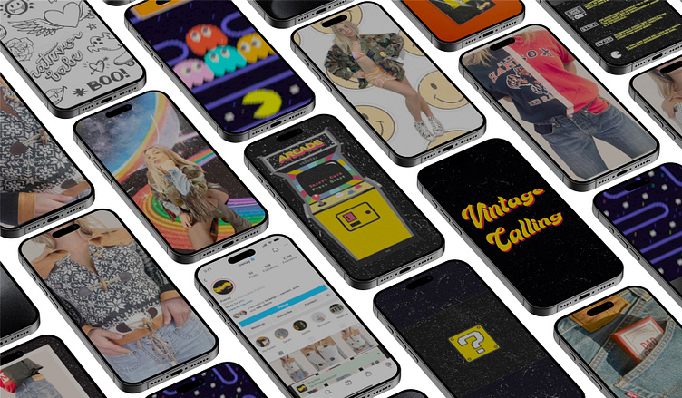
For the Frenzy project, an innovative brand that champions the circular economy and the creative reuse of materials, I was responsible for crafting the entire brand identity and designing all the visuals for social media and photoshoots. The challenge was to create an identity that was not only eye-catching but also effectively communicated the brand’s essence: the perfect blend of sustainability, fashion, and gamification.
I developed a nostalgic brand identity, drawing inspiration from vintage aesthetics with a modern, energetic twist. For social media, I crafted visuals that reflected the gamification concept, incorporating playful elements from iconic 80s video games like Pac-Man, alongside bold typography and vibrant colors designed to instantly capture attention.
Cans: Gamification and Eco-Friendly Packaging
The cans were selected to highlight the connection between gamification and sustainability, two pillars of the brand. The design draws inspiration from the colors and shapes of old-school arcade games, evoking a sense of competition and play through attractive, interactive packaging.
Umbrella: Function Meets Vintage Aesthetics
The umbrella was chosen as part of the merchandising for its dual role as both functional and aesthetic. With this item, Frenzy transforms an everyday accessory into a bold visual identity symbol, using patterns and colors that echo the retro designs of arcades and the vibrant neon lights of that era.
Magazine: Building a Narrative Through Print
The magazine was chosen as a medium to deeply tell Frenzy’s philosophy. Returning to print is a deliberate nod to analog culture, reflecting the nostalgia that permeates the brand. The zine format, with its bold graphics and visual storytelling, allows for an immersive narrative that goes beyond the product, offering customers an editorial experience that blends fashion, sustainability, and creativity.

