iOverlander Map Search App UI Redesign
Project Goal
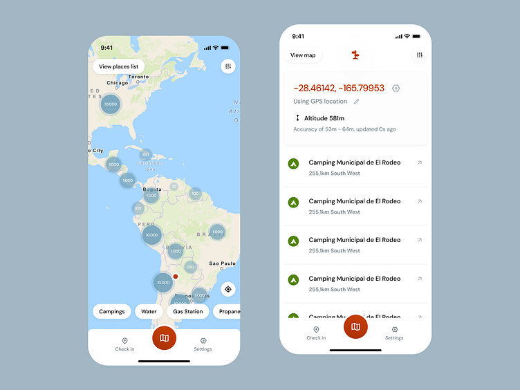
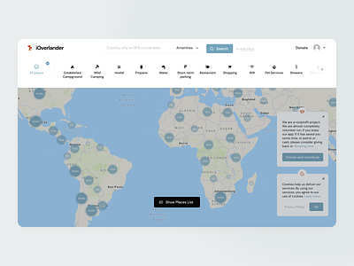
The iOverlander app has long been an essential tool for overlanders and travelers exploring remote destinations. However, the app's design had not been updated in many years, and while functional, it lacked the modern aesthetics and user-friendly components that today’s digital users have come to expect. For this redesign, my goal was to revitalize the visual identity and overall user experience of iOverlander while staying true to its core mission—providing travelers with crucial, crowd-sourced information for their journeys.
I’d love to mention that this was a volunteer work I offered to iOverlander, and they are free to grab any ideas from it to develop in the future. So I really hope to see some of this stuff one day while using this app, I usually use it when I’m looking for places to camp in Argentina.
Prioritizing Improvements
The first step in the redesign process was conducting a deep analysis of iOverlander’s current user base and understanding how they interact with the app. Overlanders, by nature, are self-sufficient explorers who need quick access to reliable information, often in areas with limited connectivity. Following a very simple research, I've categorised features based on users stories' insights and prepared a detailed plan to be guided in the design process.
With this in mind, I focused on simplifying navigation, decluttering screens, and optimizing functionality for offline use. By studying user behavior, I identified key pain points in the existing interface and designed intuitive solutions to ensure that users can find the information they need without friction.
A major aspect of the redesign was improving the visual hierarchy and layout of the app's screens. The old design felt outdated and overly text-heavy, which could be overwhelming for users, especially those on the go. I introduced a cleaner, more modern aesthetic with larger touch targets, streamlined icons, and clear, color-coded categories for easier access to information. The new design also incorporates interactive maps and visually appealing components that enhance the overall experience, making it easier to spot important points of interest such as campsites, fuel stations, and other essential services.
The redesign also places greater emphasis on community interaction, encouraging users to share updates and contribute to the platform in a way that feels more collaborative and personal.
Empathy as a driving factor
Overlanders often face unexpected challenges on the road, and the app needed to reflect a sense of community and support. To address this, I introduced user-friendly features like customizable trip planners, quick access to emergency contacts, and an improved review system that highlights helpful comments from fellow travelers.
In conclusion, the iOverlander redesign is more than just a visual update—it’s a comprehensive improvement aimed at enhancing the user experience based on the real needs and behaviors of the target audience.
By modernizing the interface, streamlining the app’s functionality, and fostering a greater sense of community, this redesign brings iOverlander into the present while maintaining the app’s original spirit of adventure and exploration.
Updated branding
It’s designed to make life easier for travelers, whether they’re navigating remote landscapes or planning their next journey.
If you’d like to see the full web and mobile apps with all of the screens and components, feel free to visit the Figma file where I worked on here ⎯
Let's build your ideas 👉 https://lisandropat.github.io/


