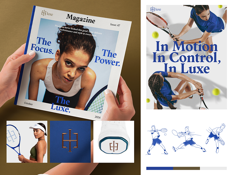
Luxe: Elegance in Motion- Visual identity
Hello all,
Excited to reveal the visual identity for Luxe, a tennis apparel brand where performance meets sophistication. The clean, modern sans serif typography embodies elegance while maintaining a dynamic edge, perfectly complementing the high-energy action shots.Every design choice, from minimalist layouts to seamless branding, reflects Luxe's commitment to refined style and athletic excellence. Scroll for detailed insights into how we’ve brought this vision to life.
What do you think? Please let me know in the comment section!
Feel free to leave feedback and don't forget to press (L) and don't forget to follow our dribbble account.
Designer : Makruf
Mockup Preview
Balanced with a minimalist design approach, Luxe blends the beauty of athleticism with understated elegance. Explore our visual narrative below
Want to collaborate with us?
Or put your message here:
Discover more of our work on:
Behance | Instagram | Website | Whatsapp | Book a call


