Upgrade // 2021
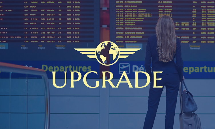
Employed as a Digital Media Intern @ Upgrade who provide worldwide VIP airport services. I was tasked to improve the cohesiveness of the existing brand and update the brand logo to give a premium, modern feel.
The first step was auditing the existing brand to understand what aspects needed improvement. It was discovered that there were several inconsistencies across the brand's social media channels, especially Instagram. Since this platform had the largest audience (546 followers), it was important that a clear brand style with a consistent layout was implemented.
Therefore, new images were carefully sourced to enhance the brand while the content was playfully showcased with an arc accent created by adapting the circle surrounding the existing logo.
Although the company director liked the new content suggestion, they wanted to explore alternative options for the logo, especially for the concept of the world. Therefore, the following designs ideas were created based on the client's requirements 1) representation of the world, 2) 'U' letter for Upgrade and 3) star representing the customer.
After sending the initial design ideas to the company director for review, he expressed that the wings from the existing logo was a defining characteristic of the brand. Therefore, this went through further iteration until the final design was reached.
After many iterations, this design was approved. To ensure the logo could not be replicated by another brand, I arranged a meeting with a trademark attorney for advice to ensure the logo had enough distinctive character for a trademark to be awarded.
It was important to consider accessibility when choosing primary background colours. By using a colour contrast checker, I ensured all options were compliant with the WCAG guidelines and AAA accessible for customers with visual impairments.
Mockups showcasing the new logo were created to ensure the company director was happy with the final outcome. They approved the final design and chosen brand colours which were applied to other digital experiences e.g. the company website.


