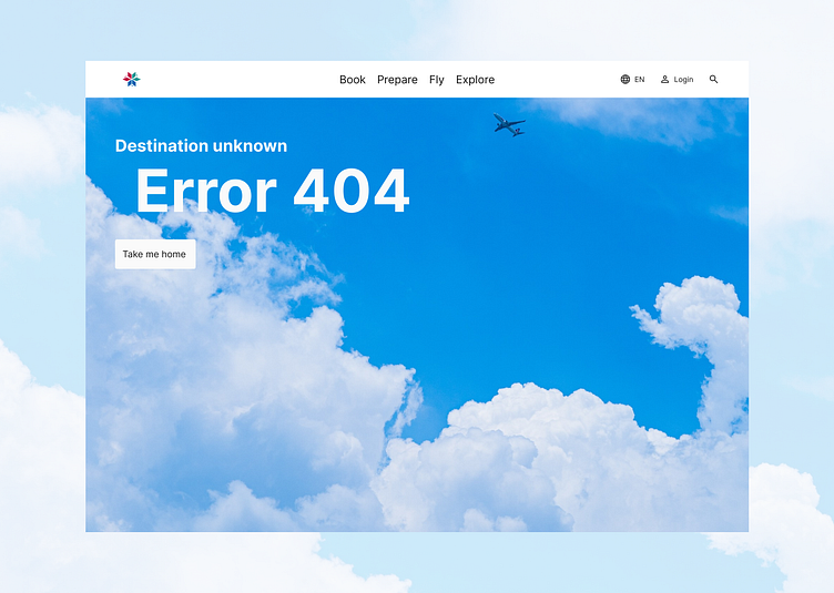
Daily UI challenge 008-404 page
Hello everyone! :)
I had so much fun with this challenge! To start, I wanted to learn more about 404 pages, and I found a really interesting article titled The Best 404 Pages: 40 Examples You Need to See on Search Engine Journal. It helped me realize just how important this page can be.
Picture this: you’re navigating a website, enjoying the experience, when suddenly you hit a dead end—a 404 page. It’s frustrating, right? But what if, instead of a cold, generic error message, you were greeted by a friendly, thoughtful page that acknowledges the hiccup?
A great 404 page does just that. It doesn’t just say “Oops!”; it offers helpful alternatives to guide you back on track, like a friend pointing you in the right direction.
The best part? The brand’s personality shines through, turning a frustrating moment into something enjoyable. You might come across a quirky image or a clever message that makes you smile.
That’s why I wanted to recreate the error page for Swiss Airlines—I thought they did an excellent job with all the things I mentioned above.
