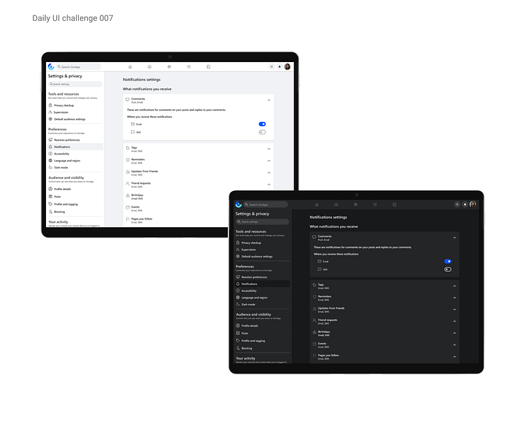
Daily UI challenge 007-settings page
Hi everyone! :)
Today’s UI challenge was especially engaging for me. A few months ago, when I tried adjusting my Facebook profile settings, I found the notifications page quite simple but not very aesthetically pleasing. Although I managed to solve my issue, I remember thinking that the design might not work well (hello, aesthetic-usability effect!).
So, when I saw today’s challenge, I revisited the page and, to my surprise, it's been redesigned! I really liked the improvements and wanted to replicate some of the elements I found appealing:
1. Grouping related settings into clear, labeled categories with brief descriptions for better context.
2. Adding a search bar and highlighting key settings at the top of the page for enhanced usability.
3. Incorporating an accordion layout for a cleaner and more efficient navigation experience.
4. Having accessibility in mind, I have decided to design a dark mode for this page.
Let me know what you think!


