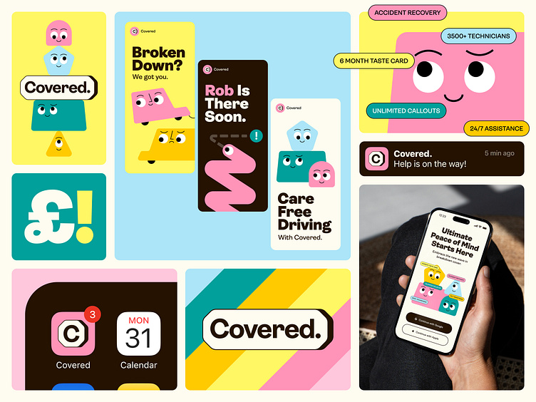
Covered Visual Identity
Redefining the standards in the
cover insurance market.
🚗💨 Covered gets a fresh look.
In a sea of dull, look-alike brands, making an impression isn’t easy. With their new identity, Covered. breaks from the ordinary, bringing a fresh, bold identity that’s vibrant & far from dull.
Insurance cover companies often struggle to stand out in a saturated market, with many brands blending into the background due to generic messaging, design, and color schemes. This makes it hard to build lasting client relationships, as companies appear interchangeable. To break through the noise, we gave Covered a fun and quirky refresh, using engaging illustrations inspired by road sign shapes, along with a bold new color scheme and the Ambit typeface.
👨🏻
Reach out and start a project
tunevmihajlo@gmail.com
More by Mihajlo Tunev View profile
Like
