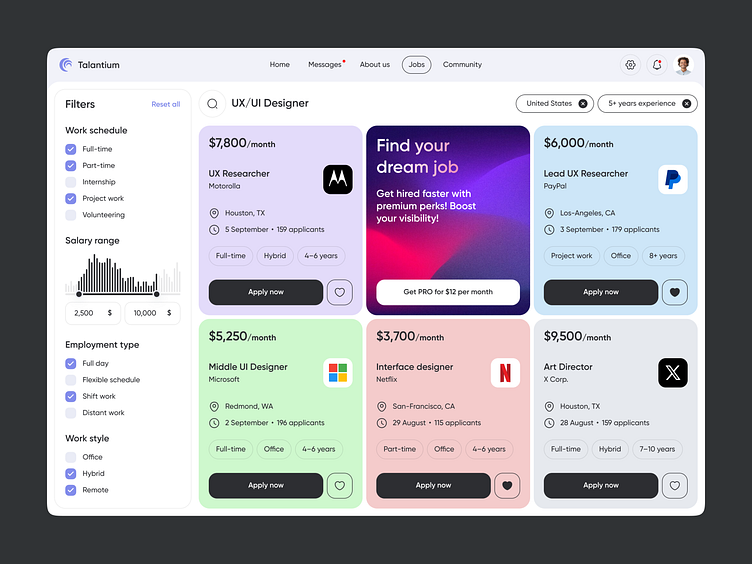
Job Finder Dashboard
💌 Have a web application idea? Let's make it together!
hello@ronasit.com | Telegram | WhatsApp | Website
Hey friends! Our team recently completed a design concept for a job search platform. Let's explore its design features.
The platform includes a job search screen with filters for searching in the left column and a results area on the right.
The main interface colors are black and white, with an additional calm yet noticeable purple hue. This palette ensures that users stay focused on viewing the job listings without distraction.
A key characteristic of this design is the color-coded job listings for easy navigation, along with extensive filters that help users find the most relevant job opportunities.
More by Ronas IT | UI/UX Team View profile
Like


