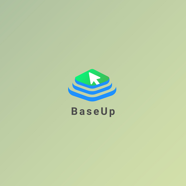
BaseUp logo is designed to represent a online education platform
BaseUp logo is designed to represent a online education platform
The logo combines a sleek, clean design with meaningful symbolism that reflects the platform's mission to empower learners through digital means. Each element, from the color scheme to the iconography, has been carefully chosen to enhance the brand’s identity and communicate its purpose effectively.
Arrow (Cursor) Shape:
Symbolism: The white upward-pointing arrow, shaped like a computer cursor, is a direct representation of online learning and the digital nature of the platform. It symbolizes growth, progress, and success, which are key aspects of the learning journey.
Form: The arrow is bold, modern, and forward-facing, conveying momentum and the idea that BaseUp leads learners to new heights.
Blue Layers:
Symbolism: The three blue layers represent books or stacks of knowledge. These layers signify the structured, tiered nature of learning— beginner, intermediate, and advanced knowledge —that users can achieve through the platform.
Shape: The smooth, wavy design of the layers provides a sense of flow and continuity, representing seamless learning progression.
