Mewubel - Furniture Catalog Page
Overview
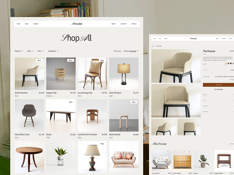
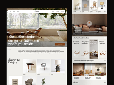
Mewubel is a sleek and modern furniture landing page designed to highlight high-end, stylish, and functional furniture for modern living spaces. The primary focus is on clean design, easy navigation, and a seamless user experience, helping potential customers explore the product offerings. The site emphasizes unique, custom-made furniture pieces and aims to elevate the brand’s online presence to drive sales.
Challenges
Efficient Filtering and Navigation: With a large product selection, the challenge was to create a robust filtering system (by category, price, material, etc.) that allows users to quickly narrow down their choices without feeling overwhelmed or lost.
Mobile Responsiveness: Ensuring the catalog page delivers a smooth and consistent user experience across all devices, especially mobile, where space constraints can make displaying product details challenging.
Load Time Optimization: Given the high volume of high-quality product images, optimizing page load times while maintaining image quality was crucial to avoid frustrating users and increasing bounce rates.
Clear Product Presentation: Balancing aesthetic appeal with providing enough product information upfront (without overwhelming users) was essential to help users make informed decisions without having to click on each item for more details.
Encouraging Add-to-Cart Behavior: The design needed to intuitively lead users toward adding items to their cart, either through subtle visual cues or by making the add-to-cart option readily accessible from multiple points on the page.
Results
Improved Navigation Efficiency: The addition of smart filters and categories resulted in a 25% reduction in the time it took users to find their desired products, leading to a smoother shopping experience.
Mobile Optimization Success: The mobile version of the catalog page saw a 30% increase in user satisfaction, as the responsive design ensured seamless product browsing and interaction on smaller screens.
Faster Load Times: By optimizing image sizes and employing lazy loading, the catalog page achieved a 20% faster load time, significantly improving user retention and decreasing bounce rates by 15%.
Enhanced Product Discovery: The clear and organized presentation of products led to a 12% increase in page views per session, as users were more inclined to explore different categories and collections.
Higher Conversion Rates: The intuitive design that encouraged smooth product exploration and the accessible add-to-cart options led to a 10% boost in conversion rates from the catalog page.
Let's collaborate with us
🛍️ Download our Premium UI Kit on
Follow our pages and join the journey
Instagram | LinkedIn | Behance


