MANAGE YOUR MONEY USAGE
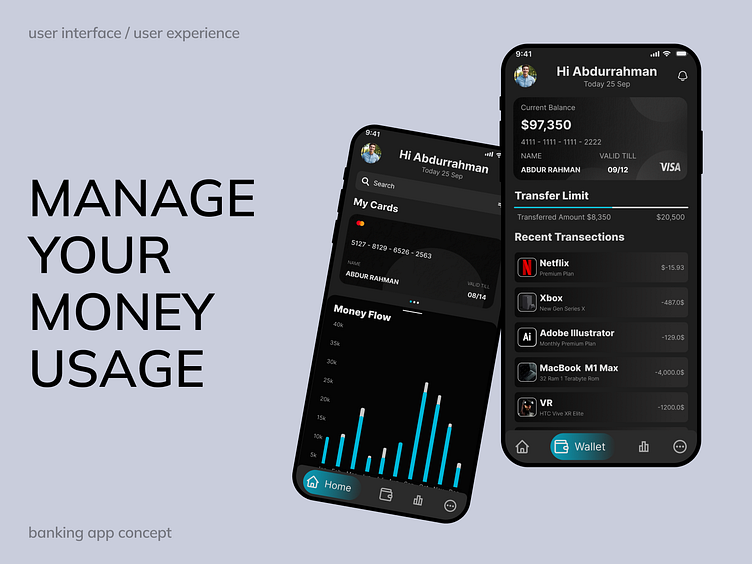
The design follows a sleek, modern aesthetic with a dark UI that enhances user focus and readability. The color palette features a balance of contrasting tones, including black (#1E1E1E) for the primary background, complemented by a vibrant blue (#00B8D9) for accents, creating a visually striking interface. Subtle grey tones (#E1E1E1 and #A8A8A8) add depth to the design, while the gradient ranging from black (#000000) to a medium grey (#2B2A2A) brings a smooth, polished finish to certain elements. The typography uses Inter, with 24 px Extra Bold for headings and key information, ensuring clarity and emphasis, while 16 px Regular is employed for body text, maintaining a clean and readable interface throughout the app.
CLEAR PRVIEW
💼 Banking Mobile App UI – A modern, user-friendly design for effortless financial management. The dark theme with blue accents makes navigating features like My Cards and Money Flow easy and intuitive. 📈
The Recent Transactions list stands out with bold typography (Inter – 24 px Extra Bold, 16 px Regular) and clear spacing, ensuring a smooth experience. 🎯 The clean color palette adds a polished touch, balancing style and functionality.
Perfect for users who value both aesthetics and practicality in their banking app! 💳


