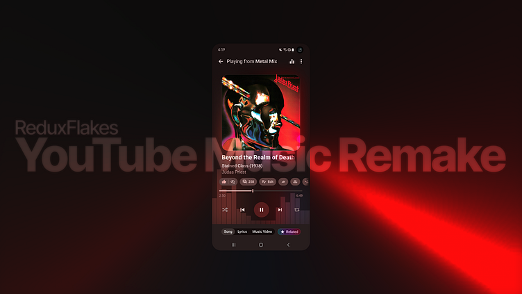
YouTube Music App Remake
Decided to do a remake of the YouTube Music mobile app after being inspired by PowerAmp's Android app, which is my default music player as of now.
The main goals with this redesign was improving the original design, making it nicer and more shiny to the eyes but most importantly improving one-hand usage by moving the media types (song, lyrics, music video) all to the bottom bar and also adding a related tab as well, inspired by Google's Gemini since AI is all the rage 😁. I've also added a visualizer to the background and a blurred version of the album cover to make the player more vivid (idea taken from PowerAmp).
I've also improve the action bar (where you can like, ignore, comment, share, etc) and added additional information the current song playing, like album and release year.
To finish, I've added some touches to the action bar at the top by reorganizing some icons and also adding an option to open the EQ of the phone (if one is available).
Additional variants can be found below.

