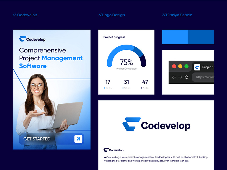
Project Management Logo Design
Project Management Logo Design Process
Concept & Research
The aim was to create a project management logo for Codevelop that resonates with developers. The design needed to reflect clarity, efficiency, and professionalism, matching the brand's focus on managing development tasks.
Typography
Cabinet Grotesk was selected for its modern, geometric style, ensuring the logo is clean, readable, and effective across both digital and print mediums.
Color Palette
The primary blue symbolizes trust and reliability, while the light blue accent adds warmth. Deep navy provides contrast for better readability, and white ensures a clean, minimal background.
Icon & Shape
The icon combines an abstract "C" with a forward arrow, representing progress and development. Its minimalist design and symmetry ensure scalability, from large screens to app icons.
Versatility
The logo works well in both full (wordmark + icon) and simplified (icon-only) versions, adaptable for light and dark themes across all platforms.

