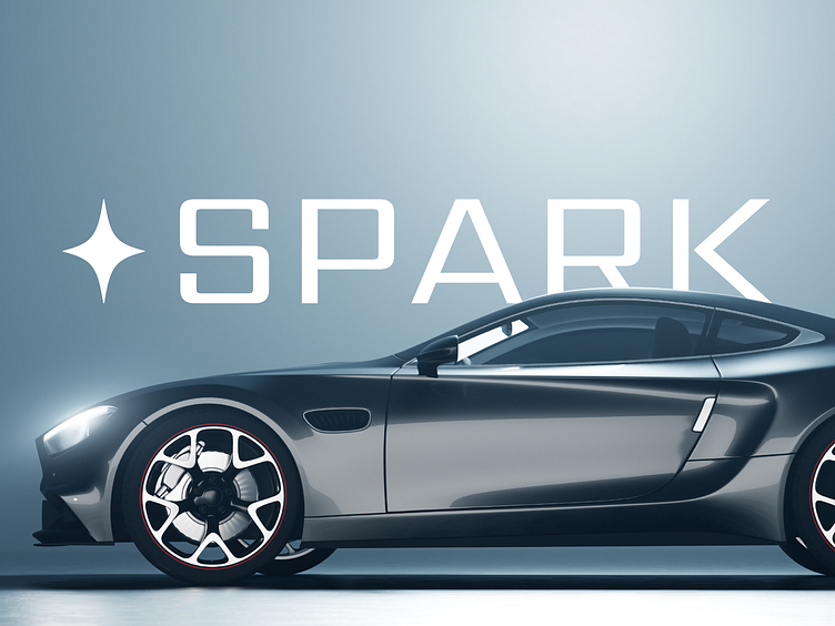
Spark Rebrand: Elevating the Future of Electric Cars
The Spark wordmark was designed with precision, balancing the weight of each letter for visual harmony. We introduced a contrast between thick and thin strokes to give it a sense of movement and energy, adding depth to the design. The result is a wordmark that feels bold and refined, reflecting the forward-thinking nature of the brand.
More by Austyn McFadden View profile
Services by Austyn McFadden
Like

