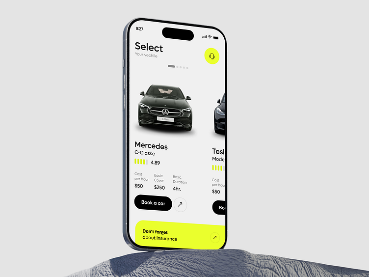
Rent a car app
Consistency in font styles, colors, and button placements throughout the app is crucial for creating a familiar and reliable user experience. Adhering to platform guidelines (such as Apple’s iOS Human Interface Guidelines) also ensures a cohesive and native feel.
Effortless Navigation: Simplifying navigation is key to a great UX. Using a tab or bottom navigation bar allows users to switch between core functions like search, bookings, and account management. The fewer clicks or taps required to complete tasks, the better the experience.
Since users often have specific preferences (such as car type, price range, or location), providing robust filtering options and a smart search function is essential. This allows users to find the perfect car quickly, improving overall satisfaction.
The design should align with the brand’s identity—whether it’s sleek and corporate or casual and traveler-friendly. Use a clean, minimalistic design to avoid overwhelming users, focusing on clear icons, intuitive navigation, and familiar patterns.
❤️Like & Add to your boards ...
We look forward to posting the next works soon ...


