🌿 Plantation NGO App - Launch Tour Designs 🌿
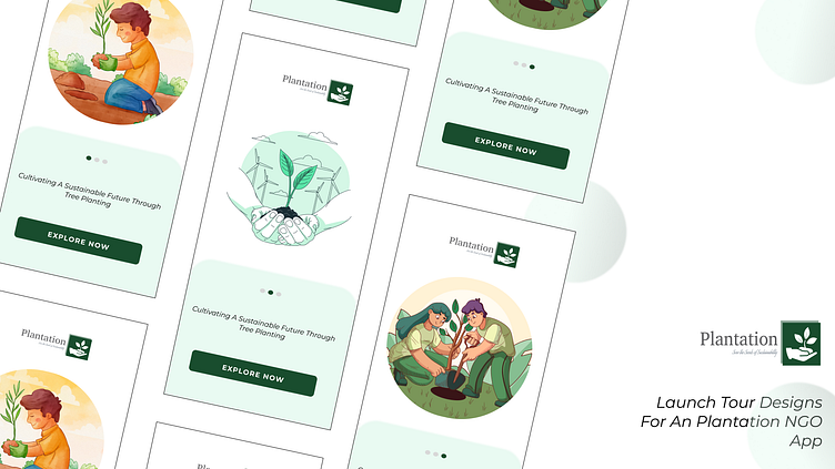
Thrilled to showcase the launch tour screen designs for Plantation Project, an NGO initiative dedicated to reforestation and sustainability. The app is designed to foster environmental stewardship and community participation through seamless user experience and thoughtful design.
🔍 Research:
Before diving into the design, we conducted thorough research to understand our target users—people passionate about environmental conservation and community-driven initiatives. We analyzed several eco-focused apps and noticed that users valued simplicity, motivation, and the ability to take quick action. This informed our decision to keep the app clean, intuitive, and actionable, with a clear focus on the mission.
👤 User Personas:
We developed two primary user personas:
Eco-Conscious Volunteer: A young adult eager to contribute to sustainability efforts. They value simplicity, inspiring content, and a sense of impact.
Community Leader: An older user who wants to organize tree-planting events and educate others about reforestation. They require straightforward access to resources and community-building tools.
Both personas seek an app that is visually engaging, easy to navigate, and offers clear calls-to-action that align with their environmental goals.
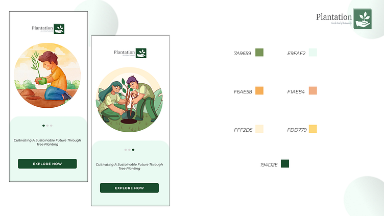
🎨 Color Palette:
The screens follow a nature-inspired color palette with soft, earthy tones and eco-friendly aesthetic.
Primary Colors: Earthy greens represent nature and growth, while soft browns evoke warmth and soil, emphasizing a grounded, eco-friendly aesthetic.
Secondary Colors: Light cream and pastel green hues were selected to create a clean, calm interface that puts the focus on the app's content while making it approachable.
Accent Colors: A darker green is used for buttons and key interactive elements like the “Explore Now” CTA, ensuring clear navigation paths for users.
✒️ Typography:
We chose Montserrat for both headings and body text. Its modern, geometric shape ensures clarity and readability across all screen sizes, while maintaining a friendly and approachable feel.
Montserrat (Sans-serif): Chosen for its versatility, clean lines, and modern look, Montserrat keeps the design fresh while ensuring legibility.
🖌️ User Interface (UI):
The UI follows a minimalist approach with smooth curves and clear visual hierarchies, emphasizing easy navigation and intuitive engagement. Custom eco-themed illustrations connect users emotionally to the cause, while icons and progress indicators guide them through the app.
Illustrations: Hand-drawn to evoke warmth and relatability, showcasing key actions like tree planting.
Buttons & CTAs: Bold and clear, ensuring users can easily find and engage with key elements like “Explore Now.”
Progress Indicators: Help users track their onboarding journey, enhancing overall flow and reducing friction.
💡 User Experience (UX):
The UX is designed to reduce barriers to action, encouraging users to engage from the moment they open the app.
Simple Navigation: The launch tour is divided into small, digestible sections that introduce key features of the app without overwhelming users.
Clear CTAs: Direct, visually distinct CTAs like "Explore Now" motivate users to engage with the app’s mission right away.
Emotional Connection: The illustrations of users planting trees foster a sense of personal involvement and responsibility for the environment.
Responsiveness: The app design is mobile-first, ensuring a seamless experience across devices and screen sizes.
📐 Design Principles:
We adhered to the following design principles throughout the project:
Clarity: Clean layouts and typography ensure that users can focus on the content and mission without distractions.
Consistency: Uniform visual elements and color palettes across screens maintain a cohesive user experience.
Accessibility: Contrast ratios and font sizes are carefully selected to make the app usable by people with varying levels of visual ability.
Engagement: Interactive elements are clearly highlighted to draw users’ attention and encourage participation in reforestation efforts.
Sustainability-Inspired Aesthetics: The color scheme, fonts, and illustrations are chosen to reflect the app’s commitment to nature and environmental sustainability.
We’d love to hear your thoughts on these designs! How can we further enhance the user experience for those passionate about reforestation and sustainability? 🍃
