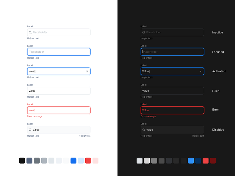
Input Field States in Light & Dark Mode
Key UX Considerations:
1. State Differentiation: The design clearly distinguishes between key input states—inactive, focused, activated, filled, error, and disabled—to guide users through different interactions and feedback.
2. Consistent Visual Language: Colors and borders are used consistently across both light and dark modes, ensuring users receive the same clarity and feedback no matter the theme.
3. Helper Text & Error Messaging: Helper text and error messages provide additional context or guidance, reducing user error and improving overall form completion rates.
4. Contrast & Accessibility: The design prioritizes high contrast in both themes to maintain accessibility, ensuring that all users, including those with visual impairments, can easily interact with the fields.
5. Dark Mode Optimization: Special attention was given to the dark mode version to ensure clarity while maintaining a comfortable, low-light viewing experience.
Research Insights:
🔍 Clear state differentiation in form fields reduces user confusion and increases form completion accuracy.
🎨 Consistency in color schemes and interaction feedback improves user trust and creates a more intuitive experience across devices and themes.
Have a complex web application idea?
Let's make it together!
Say hello at 💌
ux.sergushkin@gmail.com
Visit my Website 🌎
dmitrysergushkin.com
For more inspiration, visit my profiles ✨
