CREEKSIDE |LOGO DESIGN & BRAND IDENTITY
The Creekside brand was born with the mission of bringing relaxation and natural balance to customers, aiming to provide high-class spa experiences that help regenerate energy.
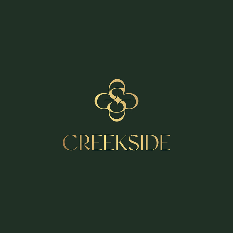
The Creekside brand identity designed by Bee Art uses 2 main colors, dark green and gold, to bring a sense of elegance and luxury. Dark green symbolizes peace and nature, reflecting the brand's mission of providing customers with relaxing experiences in a green space. Gold brings luxury, class and warmth, while suggesting the high-class, quality of the service and brand provided.
The Creekside logo is a sophisticated, stylized combination of the letters C and S in the brand name, creating a creative symbol. The soft and curvy lines of the 2 letters are combined symmetrically, creating a seamless and harmonious feeling. Overall, it creates a luxurious, classy logo, in line with the brand's mission.
--
Designed by Bee Art
-
Client Creekside
Logo and Branding Project. Logo is designed for Beauty Spa in Vietnam.
Copyright © Bee Art. All Right Reserved
Contact us:
• Hotline/ Zalo: (+84) 77 34567 18
• Email: info@beeart.vn
• Website: www.beeart.vn
• Facebook: https://www.facebook.com/BeeArt.vn


