Billio (alternative version: snow)
Billio: Banking but Better (alternative version: snow)
How can you design a fintech app that simplifies complex financial data and makes managing your finances effortless?
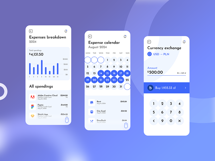
Billio is available in both light and dark modes, with a third version offering a more visually distinct approach. The last aforementioned iteration, as presented above, focuses on essential user actions. It includes several key screens: an expenses breakdown screen with a clean, easy-to-read chart, an expenses calendar highlighting upcoming payments, and a currency exchange screen.
This design iteration is heavily focused on minimalism and visual clarity, ensuring that users can quickly and easily digest complex financial data. Given that fintech apps often involve large amounts of numerical information, my goal was to present these numbers in a clear and visually compelling way. I opted for oversized typography (this time using the Josefin Sans font) and a minimalist color palette of black, white, and blue, primarily using flat colors. The design incorporates bubbles, circles, and rounded shapes throughout to create a more engaging and user-friendly experience. The overarching objective was to make Billio not only more visually appealing but also intuitive and enjoyable to use.
For more designs, visit: https://qcdesign.pl
