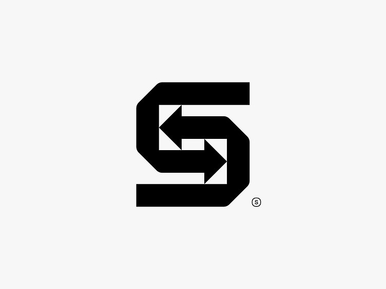
S Logomark (S + Arrows)
In this logomark, I tried to merge the letter "S" with two arrows, integrating them seamlessly into the design. I crafted the arrows in a way that keeps the "S" clear while achieving perfect optical balance. This blend adds movement and direction, resulting in a cohesive symbol where the letter and arrows work together naturally.
More by Amit Sarangal View profile
Like

