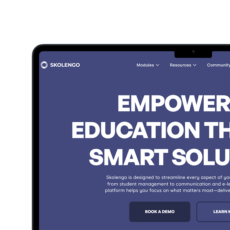
Skolengo Homepage Redesign
Roast: Skolengo Homepage
Small talk: 😅 While the UI could definitely use some love, what threw me off the most was trying to figure out what service they were actually offering. I spent some time reading through the site, even asked ChatGPT for some clarity, and eventually got the gist. But honestly, if I wasn’t planning to redesign the site, I’d have probably bounced after a few minutes.
My Goal: ✨ Simplify the UI and improve the information flow to make it more user-friendly and clear.
Result/demo: 🚀 https://willing-knowledge-573671.framer.app/
Note: This redesign is focused solely on the homepage, so links to other pages (like buttons) aren’t functional.
Instruments of Operation: 🎨
1. Framer – Full design and development of the site.
2. Figma – Where I experimented and brainstormed ideas, especially for the "Bento" section. All illustrations were done in Figma and exported to Framer.
3. ChatGPT – Helped me brainstorm and refine the copy for the site.
4. Imagen 3 – AI-generated 3D assets used throughout the design.
5. Special Mention – Isocons by @leyconnect (on X) and @meandchimso (on X), which provided some sweet isometric icons.
Limitations:
1. I couldn't find any high-quality product shots from the original site to iterate on certain sections.
2. Since Skolengo is based in France, I used Framer AI to translate everything into French. While I don’t speak French (well, not fluently), the translations should definitely be reviewed by a native speaker or copywriter.
3. The French version might not look as polished as the English one because I’d need a Framer pro plan for full customization. But hey, I just wanted to show it’s possible, and pretty easy, in Framer!
What do you think? Drop your thoughts in the comments below! 💬
Video Preview


