Live Mint App Redesign
Project Overview
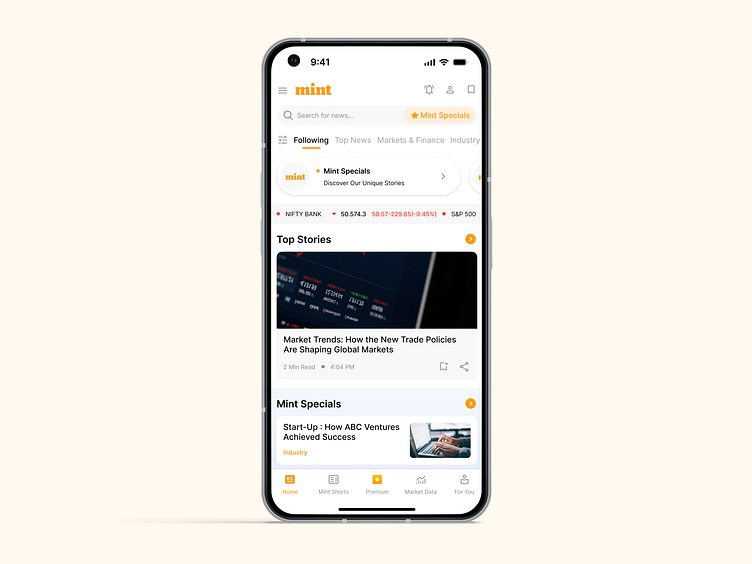
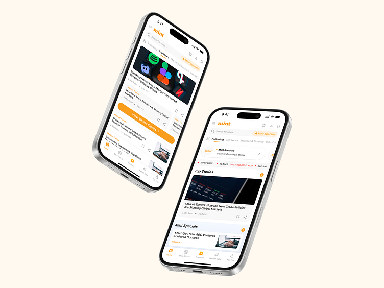
I am super excited to share my recent work on the Live Mint app redesign, which focused on giving the Home Page and Category Page a fresh, clean look. The goal was to make the app more user-friendly by streamlining the experience, decluttering the UI, and ensuring important content is easy to find and engage with.
Challenges
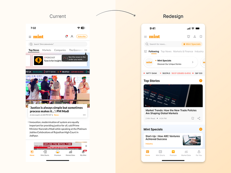
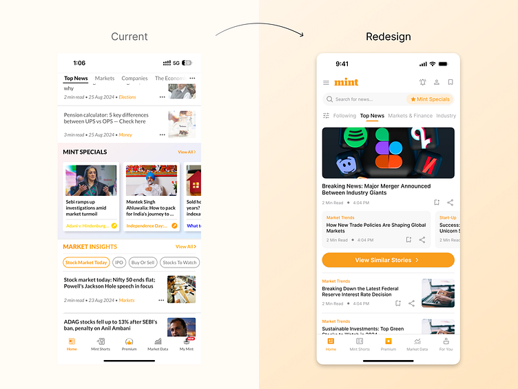
The existing interface felt cluttered, making it difficult for users to focus on what really matters.
Navigation through the categories wasn’t intuitive, with unclear icons and confusing actions.
There was no clear visual hierarchy, so all content felt like it was competing for attention.
Solution
Revamping the visual design: A cleaner and more modern look makes the app easier on the eyes and more enjoyable to use.
Improving navigation: Intuitive icons and a streamlined layout make it easier to find and use key actions like filtering, bookmarking, and sharing.
Prioritizing important content: Top Stories and Mint Specials now have a more prominent position, ensuring users don't miss out on the latest news.
Decluttering the interface: Removed unnecessary distractions to create a more focused and engaging experience.
This redesign was all about improving the user experience by simplifying the design and making the navigation more intuitive.
Ready to transform your next project with impactful design? Let's connect: sagarsingh1897@gmail.com. Discover more on my Behance Profile.
