Crew Website Redesign
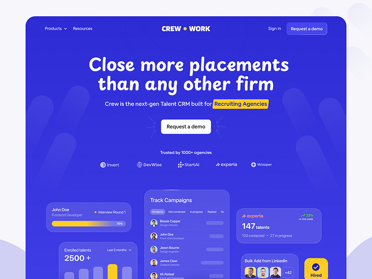
Crew has an "okay" website, but they could make it more engaging with visuals to boost conversions.
So, we took their existing site and gave it a fresh look.
1. Added stunning visuals to give users that “Wow” feeling.
2. Placed trusted logos at the top so they see them immediately.
3. Used highlighting colors to clarify the target audience.
4. Showed off platform visuals so users know what they’re getting.
5. Added a prominent CTA to make it more clickable.
A few simple tweaks = a huge difference.
So did we level up the website from the existing one?
Need help revamping your website?
Let's Talk 👋
Visit our website:
More by Aminul Haque Chowdhury View profile
Like
