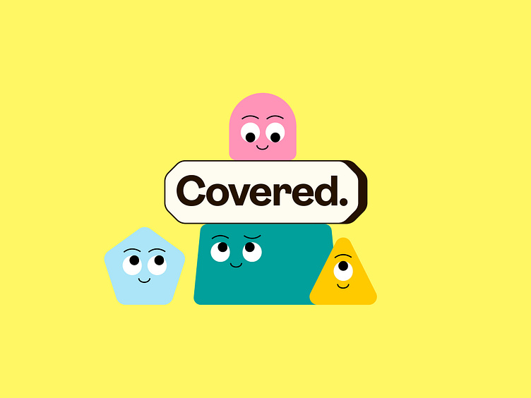
Covered Logo & Illustrations
Collaborated with Covered to launch a new logo that helps them stand out from the crowd.
The updated brand now features quirky, engaging illustrations that make Covered feel more approachable and relatable to all clients, breaking down the barriers of traditional cover insurance imagery & style. Complementing these visuals, we’ve introduced the Ambit typeface and a vibrant, revamped color scheme.
The visual identity draws inspiration from road sign shapes. The design elements reflect some form of road sign, with the logo, for example, inspired by the familiar stop sign shape. A closer look at the shape illustrations reveals they also hint at some familiar road signs. Covered’s new identity positions the company as a unique and dynamic partner in the market, ready to capture attention and connect with clients in a meaningful way.
