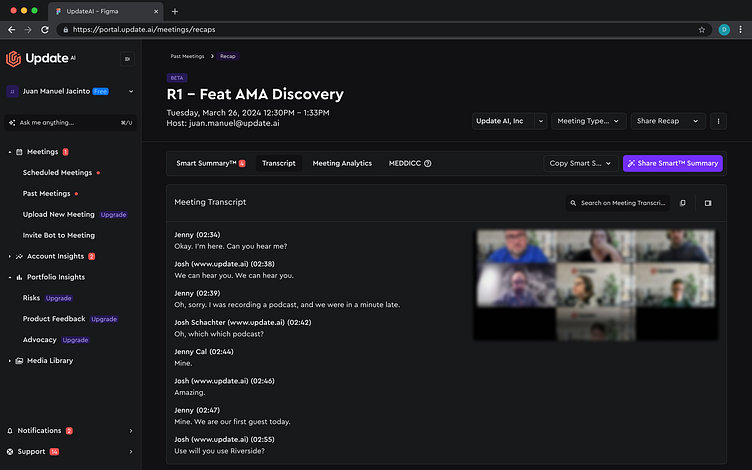
Dark Theme Design Transformation
Project Overview
Objective: Transform the existing design system into a cohesive dark theme.
Scope: Design system creation, UI/UX analysis, and implementation.
Key Highlights
Design System Creation:
Developed a comprehensive dark theme design system.
Defined color palettes, typography, and component styles.
Ensured accessibility and readability in low-light environments.
UI/UX Analysis
Conducted a thorough analysis of the current user experience.
Identified pain points and areas for improvement.
Implemented user feedback to enhance usability.
Implementation
Applied the dark theme across all major components and screens.
Maintained brand consistency while introducing a modern, sleek look.
Tested the design for performance and user satisfaction.
Visual Highlights
Color Palette: Utilized a mix of dark surfaces and vibrant accent colors to create contrast and visual interest.
Typography: Chose fonts that maintain legibility and style in dark mode.
Components: Redesigned buttons, cards, and navigation elements to fit the dark theme.
User Feedback
"The new dark theme is visually stunning and much easier on the eyes during extended use.”
“The transformation has significantly improved the overall user experience.”
Conclusion:
Successfully transformed the existing design system into a dark theme.
Enhanced user satisfaction and engagement with a modern, accessible design.
Juan Manuel Jacinto,UX/UI & IxD Accessibility Designer.
I am in continue movement looking forward to achieve my personal and professional goals. I believe the user experience is everything to sell a product or turn one to be more successful.


