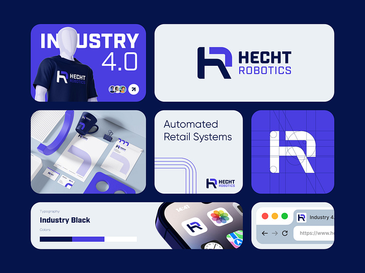
HR logo design / Hecht Robotics branding
The process behind the logo!
The client requested a minimalist and simple design that stands out from the crowd while representing a robotics theme. Their company operates in Industry 4.0, focusing on fully automated systems and small robotic cells, specifically for retail sales.
Initially, I explored concepts involving robots, but since the client prefers a cleaner, simpler look, I shifted the focus. I decided to combine the letters "h" and "r" in lowercase, integrating an arrow to symbolize direction and a network motif. This represents the interconnected nature of the client’s small cells and their emphasis on automation and networks, while subtly nodding to the robotics theme. This approach stands out by balancing automation and simplicity without relying heavily on conventional robotic imagery.


