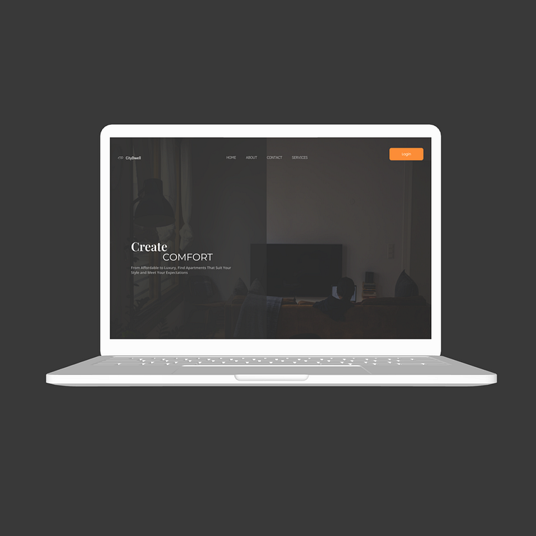
Dark theme Rental Homepage
Tab View
Mobile View
Designed a homepage with a dark theme for desktop, tablet, and mobile views. I used bright and vibrant button colors to improve visibility and make the site easier to use for everyone. The dark theme helps the buttons stand out more, making them easy to find and click. This also improves accessibility for users with vision difficulties or in low-light settings.
Why I chose Dark theme?
The dark theme reduces eye strain, especially in dim lighting.
It makes browsing more comfortable for users.
The dark theme gives the website a modern and sleek look.
It helps important elements like buttons and text stand out.
The design becomes more visually appealing.
It improves the overall user experience across all devices.
.
More by Noor ul Huda View profile
Like


