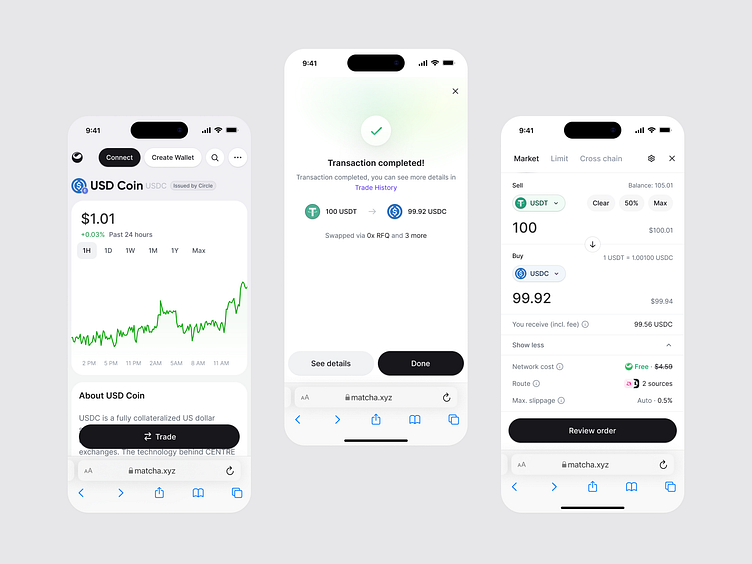
Matcha - Mobile Designs
At Matcha, we've recently updated several core mobile pages, resulting in a 5-10% increase in mobile conversion rates. Here are some of the small design changes driving it 🧵
Before: Asking users connect their wallet BEFORE accessing the trade module and receiving a quote.
After: Asking users to connect their wallet AFTER accessing the trade module and receiving a quote.
Revealing 16.2% more token page content to users leads to a reduced bounce rate.
Reducing the space by 7.4% allowed us to fully display the CTA button on the key decision-making screen.
Positioning the CTA button as sticky above the keyboard removed the need to close the keyboard or scroll down in order to continue with the trade.
More by Simon Rico View profile
Like


