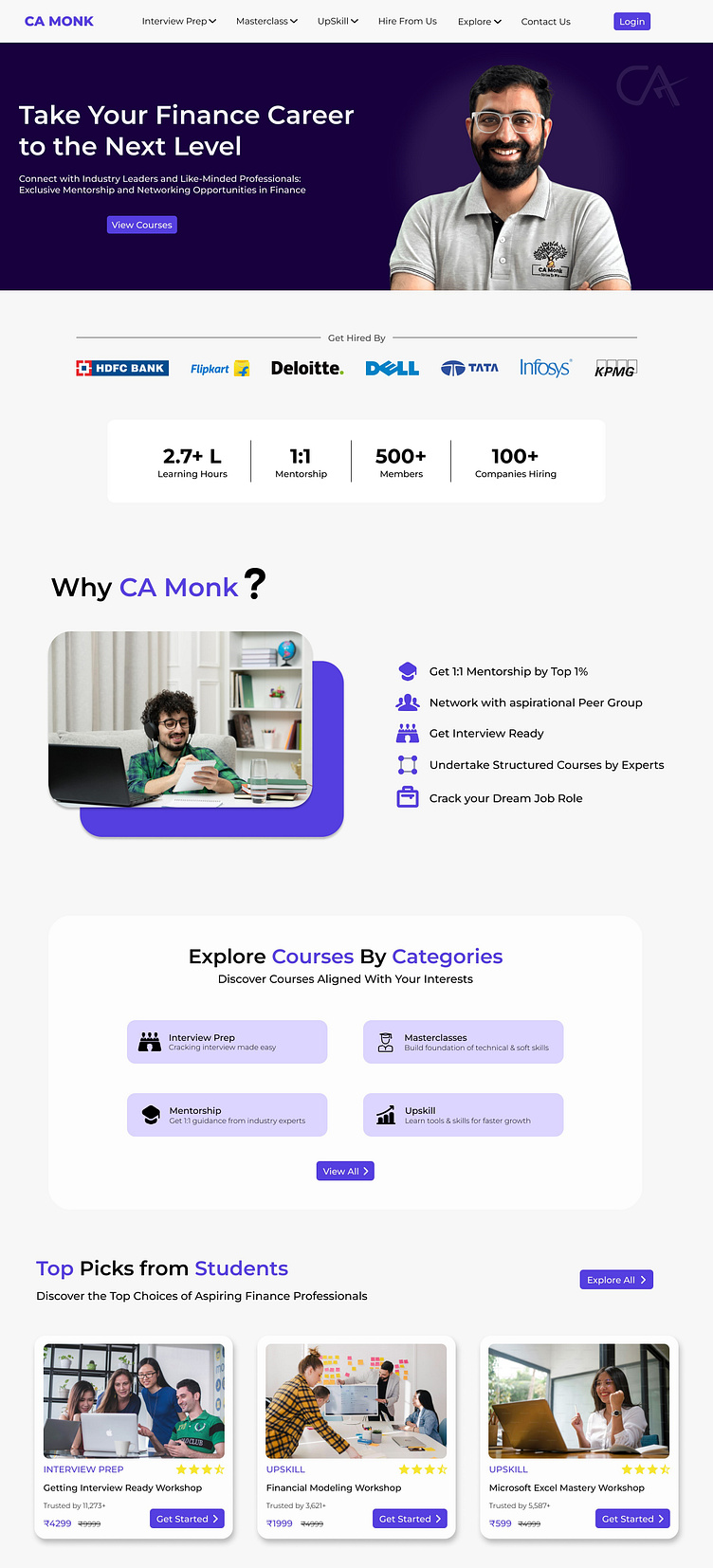
Landing Page for EdTech Company

My Approach: Crafting Digital Excellence
Before diving into Figma for a company website redesign, I took a step back to understand what worked well and what needed improvement. This involved analyzing existing user flows – the paths users take to complete tasks on the site. By identifying strengths and areas for optimization, I ensured the redesign wouldn't disrupt user habits while creating a more positive experience. This meticulous approach led to a more effective and user-friendly website.
Meeting User Needs
In the realm of educational design, aesthetics become the supporting cast, not the leading role. Here, functionality takes center stage. Crafting experiences that are as intuitive as a child's building block set, dissolving away complexity to reveal the pure joy of discovery. Information becomes a playground, not a labyrinth, empowering users to navigate their learning journey with confidence and a thirst for more.
*this was an assignment for an internship at CA Monk.
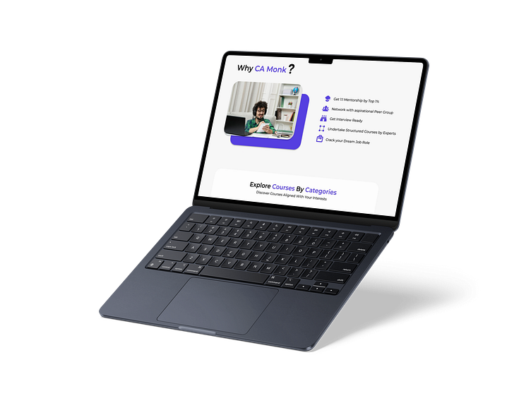
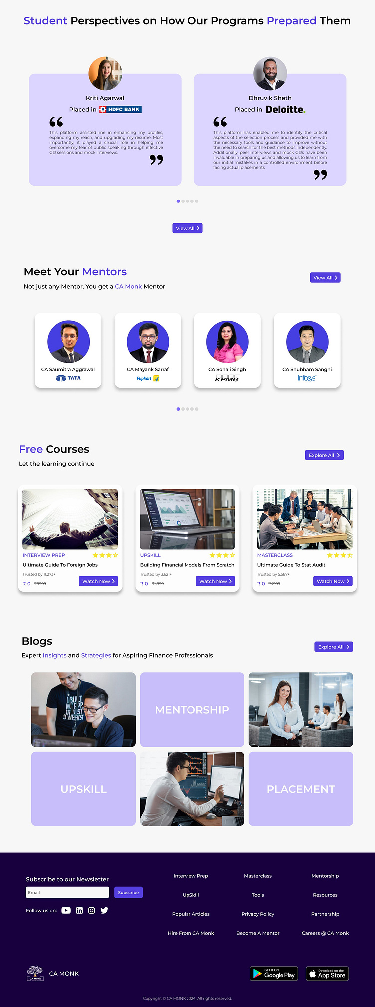
Here is the complete Landing Page view -
Thank You for Visiting!
Have any thoughts on this? Don't hesitate to give your feedback!
Feel free to save this shot and don't forget to leave a like.
Interested in Collaborating?
Let's discuss your next project!
Contact
