Keshamrit Hair Oil Branding
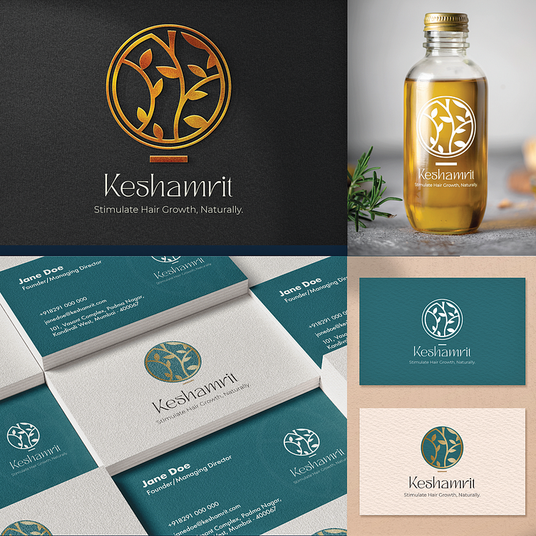
Logo Concept for "Keshamrit"
Symbolism:
Circle: Represents the cycle of life, growth, and renewal, perfectly aligning with hair growth.
Branch and Leaves: Symbolizes natural growth, vitality, and the nurturing qualities of herbs.
Teal Color: Often associated with nature, balance, and growth, further emphasizing the natural aspect of the product.
Gold Color: Continues to convey luxury, wealth, and health, suggesting a premium product that promotes hair health.
Overall Impression:
The logo effectively conveys a sense of natural, luxurious hair growth. Combining the teal circle, gold branch, and leaves creates a visually appealing and memorable symbol. The color palette adds a touch of elegance and sophistication while maintaining a natural feel.
Key Strengths:
Clarity: The logo is easy to understand and associated with hair growth.
Elegance: The color palette and minimalist design give the logo a sophisticated appearance.
Relevance: The symbolism directly relates to the product's purpose of stimulating hair growth naturally.
Overall, the logo for "Keshamrit" is a strong and effective brand representation. It successfully conveys the product's natural focus on hair growth while maintaining a premium and luxurious feel. The use of teal adds a fresh and modern element, making the logo even more appealing.
