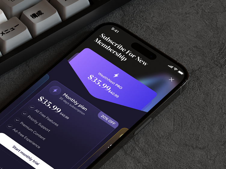
Subscription & Paywall UI Design
Introducing a sleek and modern paywall UI design, crafted to provide a seamless and engaging user experience as they upgrade to premium content.
Features:
Clear Call-to-Action: Bold and inviting upgrade button, optimized for conversions.
Tiered Pricing Plans: A comparison of subscription options with eye-catching visuals, making it easy for users to choose the best fit.
Benefits Highlight: Subtle icons and concise text showcase premium perks, encouraging users to unlock more value.
Minimalistic Design: Clean layout with a balanced use of white space, guiding the user's attention without overwhelming them.
Trust Elements: Secure payment icons and user testimonials included to build confidence.
Design Insights: This design focuses on user trust, accessibility, and clarity, ensuring an effortless journey from free to premium. The warm color palette and soft typography enhance the overall approachability of the UI.
💬 Thoughts?
Let me know what you think! How would you improve the UX or visual flow for a subscription upgrade process?
📩 jhanik.workflow@gmail.com


