Wireflow - Travel Booking App
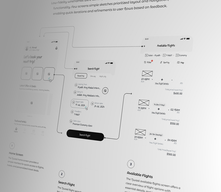
These low-fidelity wireframes were developed to map out the app's core structure and functionality. These simple sketches of key screens prioritized layout and navigation, allowing us to quickly iterate and refine the user flows based on feedback.
I was responsible for designing the UX flow to improve conversion rates for the flight booking section of a travel app, focusing on key screens: Home, Flight Search, and Flight Details.
Home Screen:
Users can quickly explore travel options with intuitive icons for flights, hotels, and packages, ensuring efficient navigation.
Flight Search Screen:
This screen allows users to input details like destination, dates, and passengers, providing tailored flight options through a seamless, user-friendly interface.
Flight Details Screen:
Displays comprehensive flight information (times, layovers, prices, seats), making it easy for users to compare and book.
I conducted extensive research on how a seamless flight booking flow should function, exploring the best possible solutions. I studied numerous blogs, case studies, and experimented with different methods to optimize the user experience.
What you see here is the result of thorough research and user testing. I’m open to any constructive feedback or criticism to ensure that this flight booking flow is as efficient and user-friendly as possible.
----------------------------------------------------------------------------------------
More to come soon. What are your thoughts on this?
You have an exciting idea? Let's chat. Say hi at ozeerahmad92@gmail.com
Thank you! have a nice day ✌🏼
