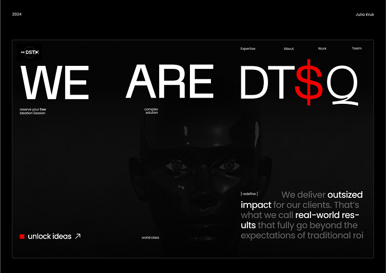
The Puzzle of Progress: DTSQ’s Design
Creating this landing page for DTSQ felt like stepping into uncharted territory. 🌍
I wasn’t just designing a page. I was weaving together ideas of innovation, AI, and meaningful connection. It wasn’t about flashy aesthetics but about crafting something that truly reflects the soul of the agency and the possibilities it opens up.
🔍 What was hard: Breaking past the usual boundaries to find the real meaning behind the design.
🛠 The process: It wasn’t always smooth. At times, I felt lost, but that’s where the real growth happens.
🚀 The result: A design that doesn’t just look good but captures DTSQ’s bold leap into AI-driven marketing.
Check out the full project and see how I’ve tried to capture the essence of DTSQ. I hope you can feel the energy and care that went into every part of it.
