UI/UX DESIGN
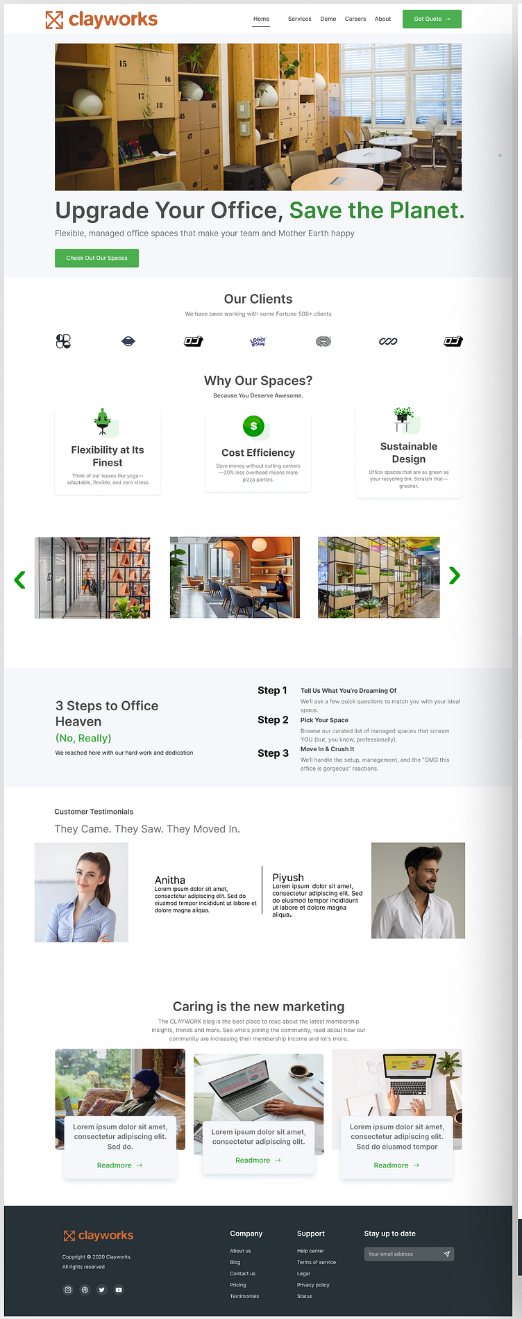
LANDING PAGE LAYOUT-PC VIEW
The landing page layout is designed to create a strong first impression with a clean, modern aesthetic that balances visuals and functionality. The hero section features a bold headline over a full-width background image, drawing visitors in with a clear call to action. Below, a concise two or three-column layout highlights key offerings with minimal text and striking icons or images. A featured video or image carousel further engages the user, while testimonials add social proof. The page ends with a sleek, informative footer containing essential links and social media icons, encouraging seamless navigation and interaction.
More by saiprabha View profile
Like

