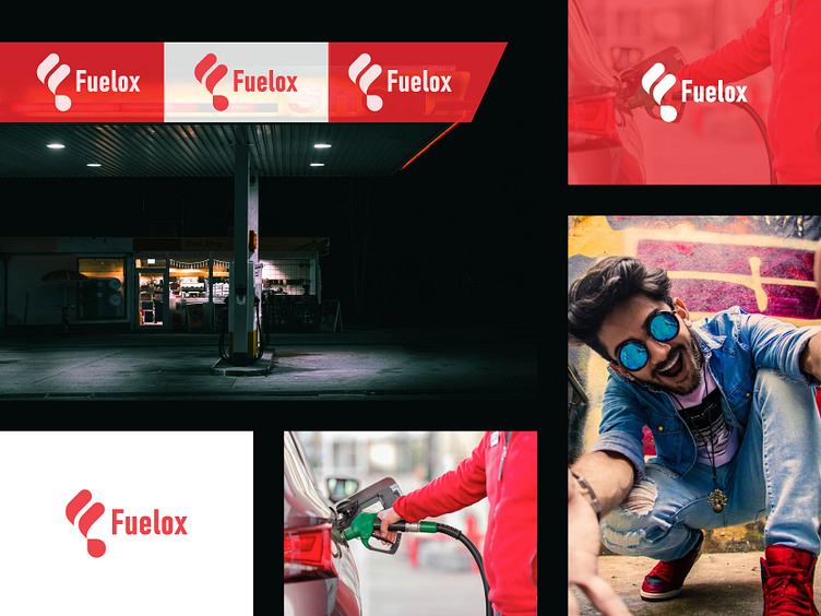
The Design of the Fuelox Logo - Fuel pump logo Design
Fuel pump logo | The Design of the Fuelox Logo - Combining the 'F' Letter and Drop Mark
Client: Fuelox
Design Firm: Alim Designs
Project: Logo Design - 'F' Letter and Drop Mark Combination
Introduction:
Fuelox, a dynamic company in the fuel industry, approached Alim Designs with a clear objective: create a modern, impactful logo that symbolizes their core fuel distribution business while conveying innovation, reliability, and sustainability. The challenge was to develop a simple yet distinctive design that could be easily recognized across various platforms, from digital media to physical branding materials such as fuel tanks and uniforms.
Alim Designs decided to incorporate two key elements in the logo: the letter "F" (representing Fuelox) and a drop mark (symbolizing fuel, energy, and sustainability).
Design Objectives:
Simplicity & Versatility: The logo had to be simple enough to be recognizable at any scale while still visually compelling.
Symbolism: The logo needed to communicate the essence of the business—fuel distribution—using modern, clear visual language.
Memorability: It had to stand out in a competitive market, where Fuelox competes with established brands.
Future-Proofing: The design had to be adaptable for future brand expansion, especially if Fuelox were to venture into other forms of energy.
Concept Development:
During the initial brainstorming, Alim Designs identified that combining the letter “F” with a drop shape would create an immediate visual connection between the brand name and its industry.
Key Concepts Explored:
The Letter ‘F’: The "F" would represent both the company’s name and its core attributes—strength, stability, and forward motion.
The Drop Shape: Representing a drop of fuel or energy, the drop was chosen to suggest fluidity, energy, and the essence of Fuelox’s service. It also hints at sustainability and future energy solutions.
Integration of the Two Elements: The challenge was to seamlessly integrate the letter "F" with the drop, without either element overpowering the other, ensuring balance and harmony.
Design Process:
Sketching & Prototyping: Alim Designs began by sketching various iterations of the "F" in combination with the drop shape. Initial versions explored:
Refinement: After multiple rounds of sketches and digital mock-ups, the chosen design featured a clean, angular "F" with a subtly curved drop integrated into its vertical stroke. This integration allowed the logo to remain bold and modern while adding a fluid, organic element that represented fuel. The combination of these two shapes provided a harmonious balance between industrial strength and dynamic energy.
Typography and Color:
Typography: A sans-serif font was selected to complement the modern, minimalistic look of the logo. The font's clean lines aligned with the forward-thinking, reliable identity of Fuelox.
Color: Alim Designs explored several color palettes, ultimately settling on deep Red and vibrant White . Red symbolized Energy , professionalism, fuel, and stability, while the white represented trust . The drop was rendered in a solid color. reinforcing the idea of fuel flowing and energy transformation.
Final Logo:
The final logo combines the "F" and drop mark in a way that’s both subtle and striking. The letter "F" is bold, with a sleek, rounded design, and the drop subtly emerges from its form. The Solid effect on the drop symbolizes both fluidity and energy flow, while the solid "F" suggests reliability and strength.
This design proved versatile across various mediums—the logo maintained its clarity and impact on a small-scale digital icon or a large billboard. Additionally, the integration of the drop allowed the logo to hint at sustainability, positioning Fuelox as a forward-thinking energy provider, capable of evolving into cleaner energy sources in the future.
Results
The new Fuelox logo was rolled out across the company’s digital and physical touchpoints. Early feedback was overwhelmingly positive, with both customers and industry professionals praising the design for its clarity, modernity, and symbolic strength.
Key Outcomes:
Increased Brand Recognition: The combination of the "F" and drop mark provided an easy-to-remember visual identity that quickly became associated with Fuelox’s reliability and forward-thinking approach.
Market Differentiation: The unique logo helped Fuelox stand out in the highly competitive fuel market, where many brands use clichéd symbols like flames or simple text-based logos.
Adaptability: The logo was versatile enough to be used across Fuelox’s expanding product lines and marketing campaigns, ensuring the brand identity could grow with the company.
Conclusion
The Fuelox logo, with its elegant combination of the "F" letter and drop mark, showcases how thoughtful design can elevate a brand’s identity. By integrating the core aspects of the company’s name and industry into a cohesive, modern symbol, Alim Designs created a logo that is both timeless and adaptable, reflecting the future-focused ethos of Fuelox.
