Billio (dark theme)
Billio: Banking but Better (dark theme)
How can you design a fintech app that simplifies complex financial data and makes managing your finances effortless?
Before designing Billio, I conducted some research into fintech user preferences, focusing on the need for intuitive financial management tools. Users prioritize seamless access to transactions, clear breakdowns of savings, expenses, and incomes, and efficient processes for transfers and exchanges. This research guided the development of a user experience that simplifies navigation, enhances transparency, and streamlines key financial functions, meeting users’ expectations for convenience and clarity.
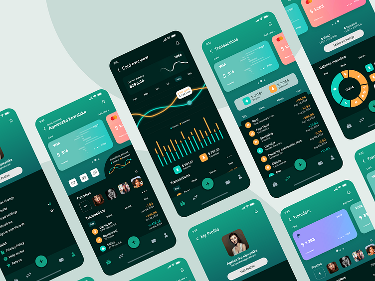
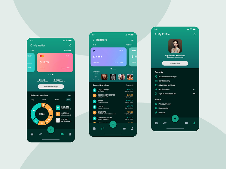
Billio offers integration with credit and debit cards, providing access to essential functions such as mobile payments, transaction history, and recent transfers. It also includes features like currency exchange and chat support. The app displays income and expenses breakdowns, with visual representations through charts and filters by time periods or categories.
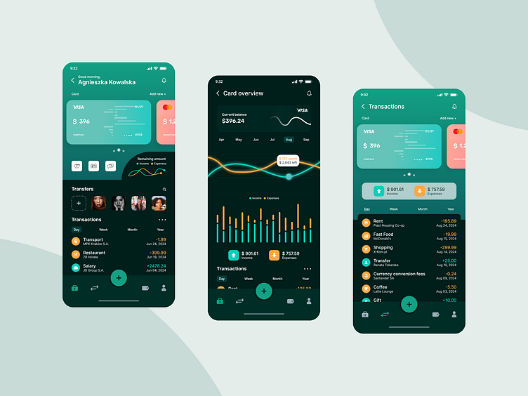
The design is sleek and modern, with green chosen as the primary color for Billio to symbolize wealth, financial stability, and trust - key elements for building user confidence. Green also reflects growth, innovation, and security, aligning with the core values of a modern fintech app. Successful financial institutions like Acorns, TD Bank, and Fidelity use green to convey these values. Saturated turquoise highlights income, contrasting with an orange/saffron color for expenses. The font used is Inter, a highly legible sans-serif typeface designed for clarity and readability on screens.
The Floating Action Button, a distinctive round button that 'floats' above the interface, should draw attention to key actions. In Billio, the primary action is making a quick payment, while the secondary action is initiating money transfers. The FAB provides users with a quick and intuitive way to perform these actions.
Billio is available in both light and dark modes, with a third version offering a more visually distinct approach.
For more designs, visit: https://qcdesign.pl
