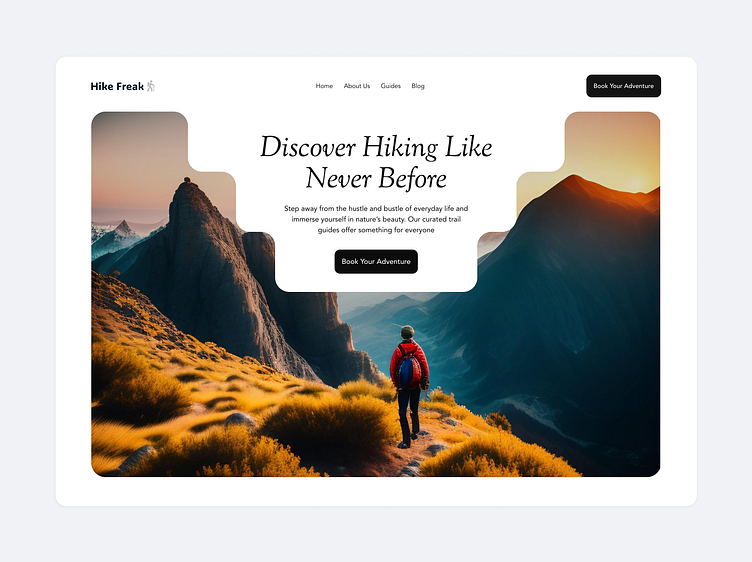
Hero page for a hiking website.🚶🏽
Here's a hero page exploration for a hiking website.🚶🏽
I find it really interesting how your choice of image can change the overall tone and mood of a website design.
Which tone works best for you?
A, B or C?
More by Timilehin Oladapo View profile
Like


