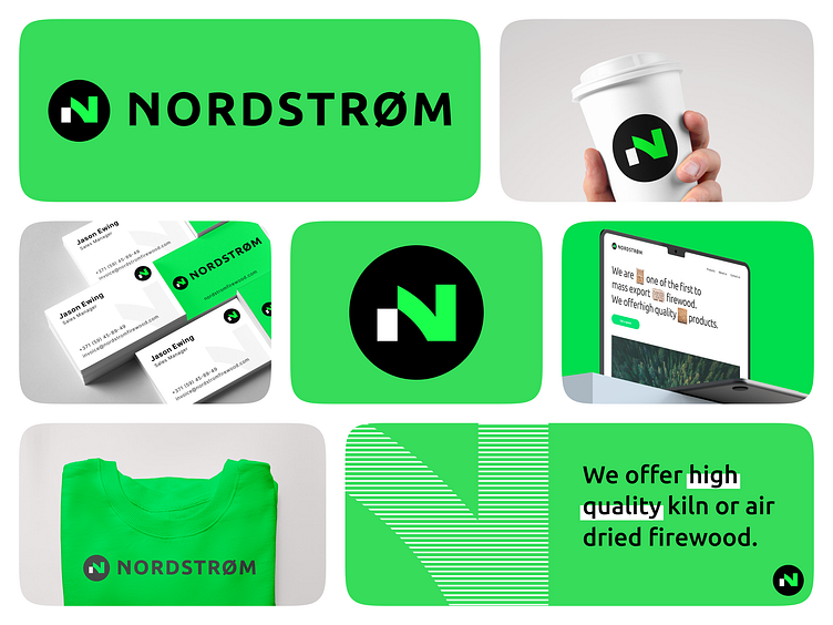
Branding for a company selling firewood | Nordstrom
Hello Dribbble community ! 👋
We are happy to present our new project - a corporate identity for a major firewood producer and supplier in Europe.
We have developed several corporate identity concepts for this company. And this is without a doubt one of our favorites.
Modern and dynamic, yet elegant and stylish, the logo reflects the level of the Nordstrom brand.
Nordstrom Firewood is a company that sells high-quality firewood. Founded in Denmark in 1979, the company is now in its third generation. The company strives to fully meet customer expectations and has established itself as a reliable partner in the B2B wood fuel supply industry.
We used bright green in combination with white and black. Neon green symbolizes freshness, innovation, energy and life, which adds to the brand's modernity and connects it to nature. Black stands for stability and white for purity and transparency of processes.
The central element is the letter "n" in a circle symbolizing a felled tree trunk, representing the unity and integrity of the company. Inside the circle is the letter "N", which evokes associations with movement and progress. The type portion of the logo is laconic but supports the idea of striving for innovation, with smooth curves similar to the forms of the letter "N". The arrow-like shape of the letters reflects the desire for success and dynamism.
Looking for a world-class solution for your business?
Let's get in touch👇
Or visit our website to learn more about our services.
