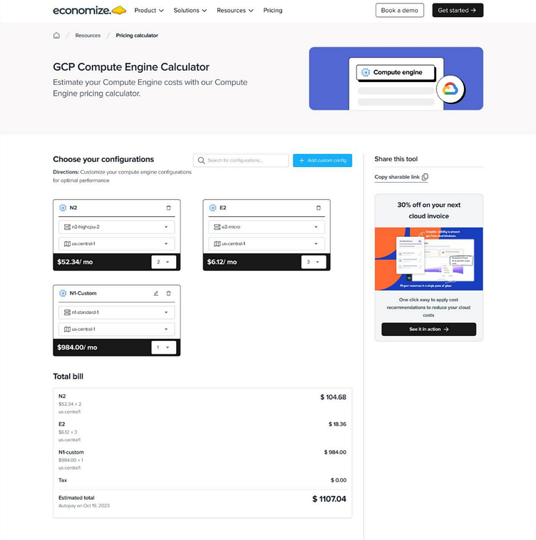
Resources Section of Economize's Landing Page. 🖥️
Challenge: The dense information in the resources section was challenging for users to navigate and understand.
Approach: I restructured the content using a grid-based layout that segmented information into clear, digestible parts. Interactive filters and clear headings were introduced to aid navigation.
Techniques: Strategic use of infographics, iconography, and a well-defined typographic hierarchy, supported by iterative testing.
Outcome: The revamped section now makes it easy for users to locate and comprehend critical information, enhancing overall site usability.
