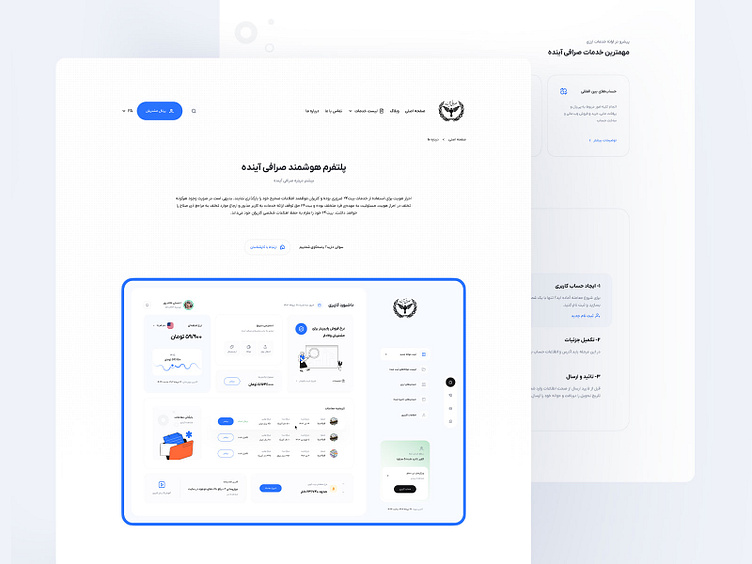
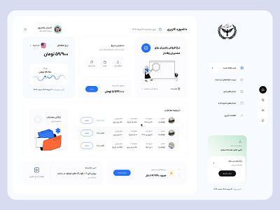
Landing page - Ayandehexchange
Hi Friends 🤟
In designing the landing page for the currency exchange platform, Ayandeh, my primary objective was to create an intuitive and visually appealing user experience. By employing a clean and minimalist design, I aimed to capture users' attention while ensuring that navigation remains straightforward and seamless. The color palette was carefully selected to evoke trust and professionalism, aligning with the brand's values.
Furthermore, I focused on optimizing interactive elements to facilitate user engagement. Each component was strategically placed to guide users effortlessly through the information they seek, enhancing usability. This approach not only aims to provide a satisfying user journey but also to encourage conversions, ultimately supporting the platform's goals in the competitive market.
For more details, scroll down. 👀
The clean and modern design, adhering to minimalist principles, ensures that users can focus on their goals in the cryptocurrency world without distractions.
Your feedback is invaluable, and I’d love to hear your thoughts on this project.
💖 Press "L" if you love it and feel free to give your thoughts and feedback. That's all, have a great day!
I am available for new projects, Let's chat:
For quick inquiry feel free to add me on:
Telegram | Instagram | Twitter | Skype | What's app


