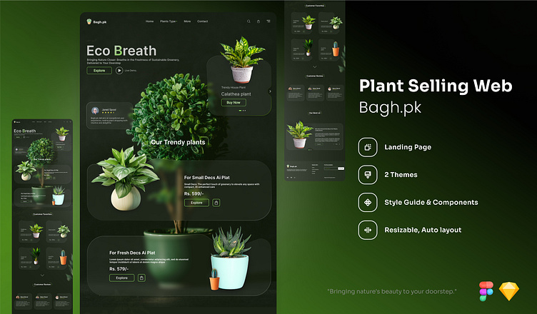
🌿 Bagh.pk - plant's selling web.
Key Elements and Features
Bagh.pk - Plant Selling Website Case Study
Introduction
As a Senior UI/UX Designer, my goal was to craft a seamless and visually engaging e-commerce experience for Bagh.pk, a platform dedicated to bringing the beauty of plants into homes. The website balances aesthetics with user-centric functionality, ensuring that customers can easily discover, learn about, and purchase plants.
Logo & Branding
The Bagh.pk logo is prominently positioned in the top left, setting a fresh, nature-inspired tone. The minimalist leaf design paired with soft green tones emphasizes the brand's connection to nature, while the clear, modern typography reinforces its clean and eco-conscious identity.
Navigation
The navigation is simplified to improve user experience, featuring:
Home
Shop Plants (with dropdown categories)
About Us
Cart
This structure allows users to intuitively explore the site without feeling overwhelmed.
Hero Section
Captivating Plant Image: A visually striking image of lush plants draws immediate attention, inviting users to engage with the brand.
Headline: A clear, impactful tagline, such as "Breathe Nature In," welcomes users, aligning with the company’s mission of promoting greener, healthier spaces.
Call to Action: A standout "Shop Now" button in a vibrant accent color, strategically placed for maximum visibility, encourages users to browse the plant collections right from the start.
Plant Categories
The shop features a clean layout, with plants organized into intuitive categories:
Indoor Plants
Outdoor Plants
Succulents
Rare Finds
Each category is presented with a hero image, enticing users to explore further. The plant categories align with user intent and simplify the discovery process.
Product Cards
Each plant is showcased in a beautifully designed card that includes:
High-quality images
Plant name and price
A short, engaging description
An "Add to Cart" button
Hover effects and smooth transitions enhance interactivity, keeping users engaged.
Product Details Page
Every plant has its own page, offering rich content:
High-Resolution Images: Multiple angles and close-ups for a detailed look at the plant.
Care Instructions: Helpful tips on how to nurture the plant, boosting the user’s confidence in making a purchase.
Size and Dimensions: Clear details to help users envision the plant in their space.
Customer Reviews: Real feedback to assist users in making informed decisions.
Cart & Checkout
Functional Cart: Designed with usability in mind, the cart provides clear summaries of selected items, total cost, and easy adjustment options (remove items, change quantities).
Secure Checkout: A streamlined checkout process ensures minimal friction, focusing on speed and simplicity, with secure payment gateways for user trust.
Footer Design
The footer enhances navigation by including:
Contact Information: Easily accessible support details, including phone, email, and social media links.
Essential Links: Quick access to FAQs, terms and conditions, and privacy policies.
Sustainability Commitment: A short message reminding users of the company’s dedication to eco-friendly practices.
Design Considerations
Color Scheme: The dark theme creates a sense of luxury and sophistication, while fresh, green accents bring life and energy to the design, making it both welcoming and elegant.
Typography: A modern, legible font set is used to ensure clarity across all devices, enhancing both readability and brand consistency.
Mobile Responsiveness: The design adapts seamlessly to mobile devices, ensuring users have a flawless experience, whether browsing on a desktop or a smartphone.
User Experience (UX) Prioritization
Key UX goals include:
Clear Navigation: Users can quickly find what they’re looking for, whether they’re browsing or ready to buy.
Fast Loading Times: Optimized images and minimalistic design elements keep the site fast and efficient.
Secure Payments: Trust is built with clear indicators of secure, safe checkout methods.
Sticker & Brand Identity
The Bagh.pk sticker design complements the brand's eco-friendly image, featuring a natural, vibrant color palette and minimalist plant motifs. It reinforces the brand's focus on nature, sustainability, and breathability.
System Design Recommendations
A robust backend infrastructure should be implemented to manage:
User Authentication: Secure logins and user accounts for a personalized shopping experience.
Product Management: Easy backend management for adding/removing products and updating inventory.
Order Processing: Efficient handling of orders and fulfillment.
Payment Integration: Secure integration with payment gateways like Stripe or PayPal for a smooth transaction process.
