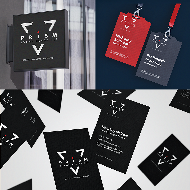
Prism Event Heads LLP Branding
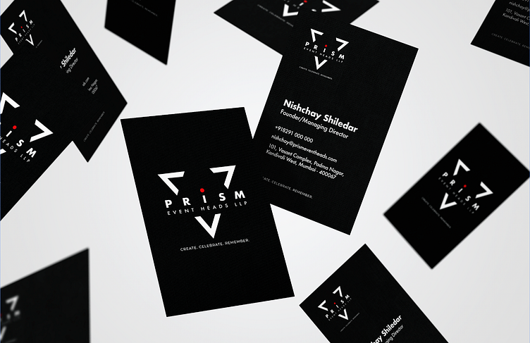
Branding Concept:
The logo for Prism Event Heads LLP is a minimalist and modern design that effectively conveys the company's identity and purpose. Here's a breakdown of the key elements and their significance:
Triangle: The triangle is a powerful symbol representing stability, strength, and progress. It's also a geometric shape that is visually appealing and easily recognizable.
Prism: The word "Prism" is prominently displayed within the triangle, immediately identifying the company's name. A prism is an optical instrument that disperses light into its constituent colors, symbolizing the diversity and vibrancy of events that Prism helps create.
Dot: The red dot within the triangle adds a touch of color and visual interest. It also represents the focal point of an event, drawing attention to the celebration and experience.
Create. Celebrate. Remember. The tagline reinforces Prism's mission to create memorable events that are celebrated and cherished. It emphasizes the lasting impact that events can have on individuals and communities.
Overall, the logo design for Prism Event Heads LLP is a well-executed representation of the company's brand and values. It is visually appealing, and memorable, and communicates effectively the company's commitment to creating exceptional events..